Doublespace Learning
Client: Gauri Kohli
Scope of work: Brand Strategy, Brand Identity and Communication Collaterals
Industry: Education and Learning
In today’s world of one too many modes of communication, DoubleSpace is a breath of fresh air. As a communication enhancer, they help you understand what to convey and when. Their mission is to combat the lack of communication in the Indian education landscape.
With the belief that all writing and speech can be made more effective when structured with the intention to spread a message, DoubleSpace required a branding language that communicated its own mission statement optimally. Our goal was to overcome the challenge of building a distinct visual identity for a company that centered around words and languages.
Through the brand language, we wanted to inspire the average Indian to be articulate communicators so that it would empower them to stand out from the crowd.
How do we create a strong visual identity for a brand that is all about words and language?
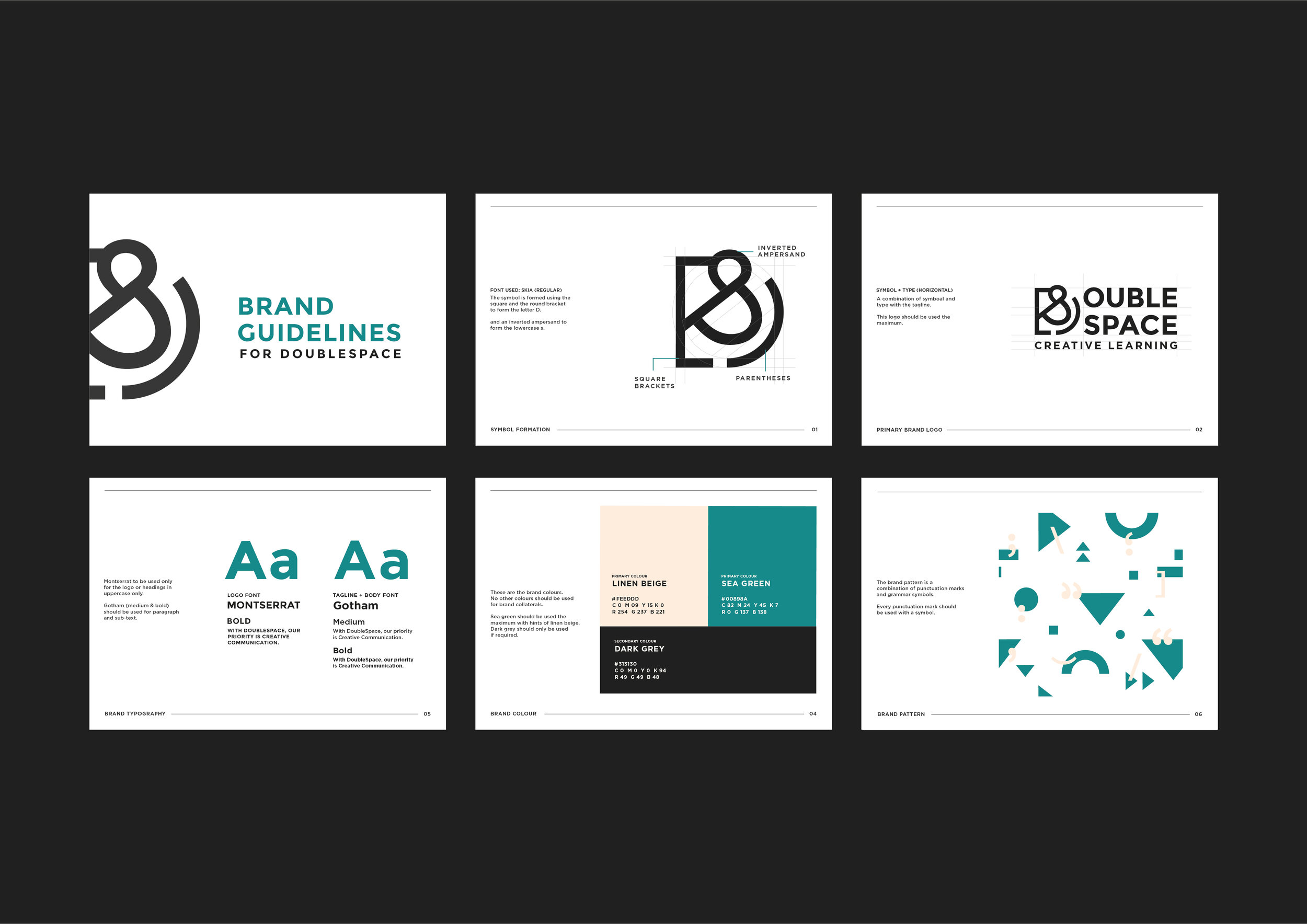
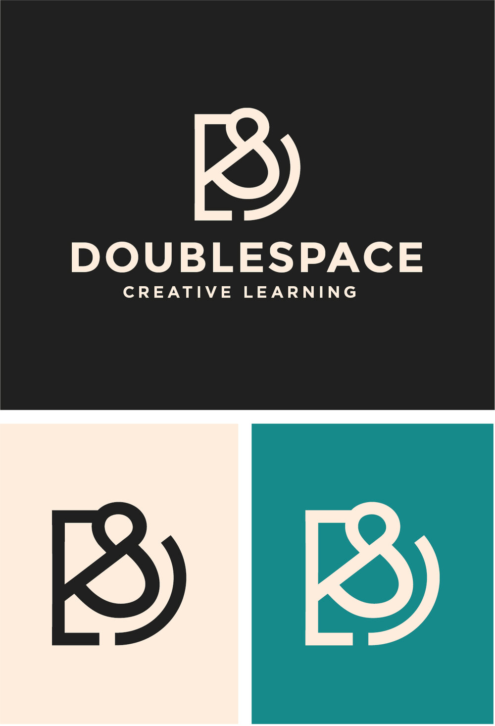
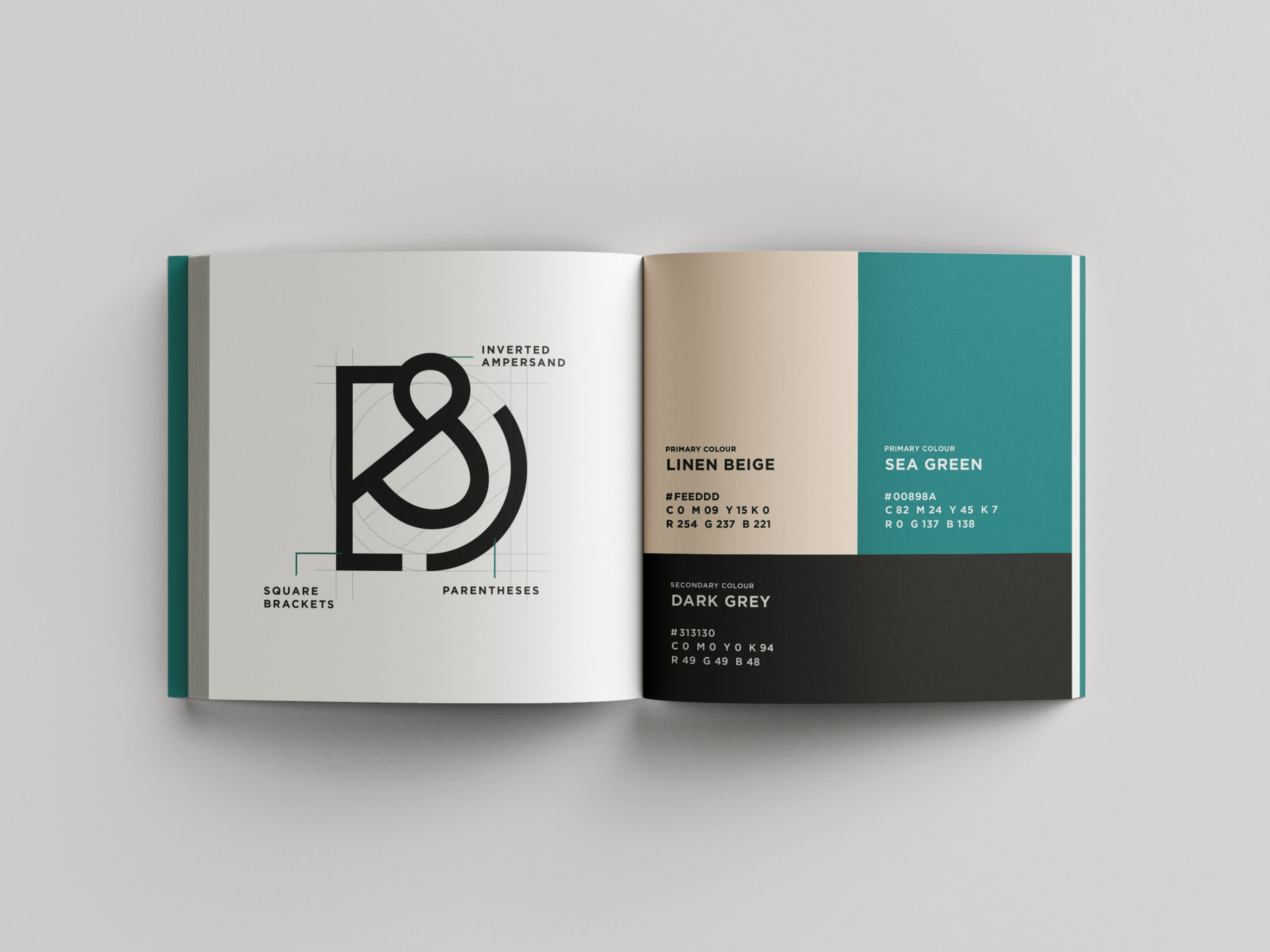
We began by focusing on how to integrate both words and imagery to build their brand language. After much brainstorming and drafting, we designed their symbol by combining two brackets and an inverted ampersand. Through this, we wanted to relay the importance of punctuation and grammar in writing and speech and highlight the fact that structure and placement are key ingredients for effective communication.
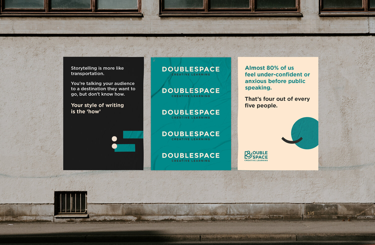
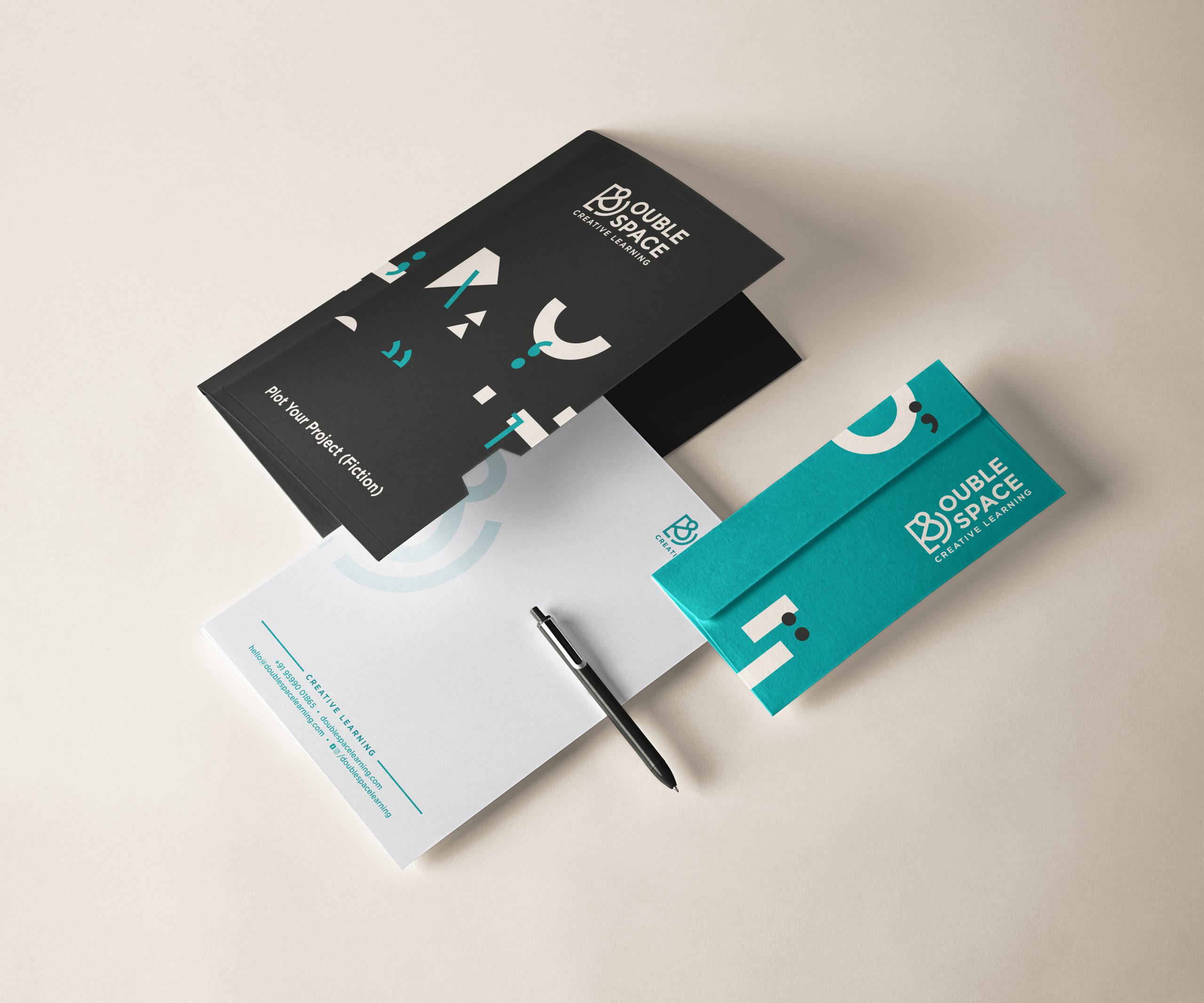
It was important that DoubleSpace had a wordmark and symbol with a very strong visual remembrance and the flexibility to be adaptable in different applications. We used a simple, bold sans serif typeface contrasting against a unique colour platter to incorporate the fun and vivacious energy that the brand offers.
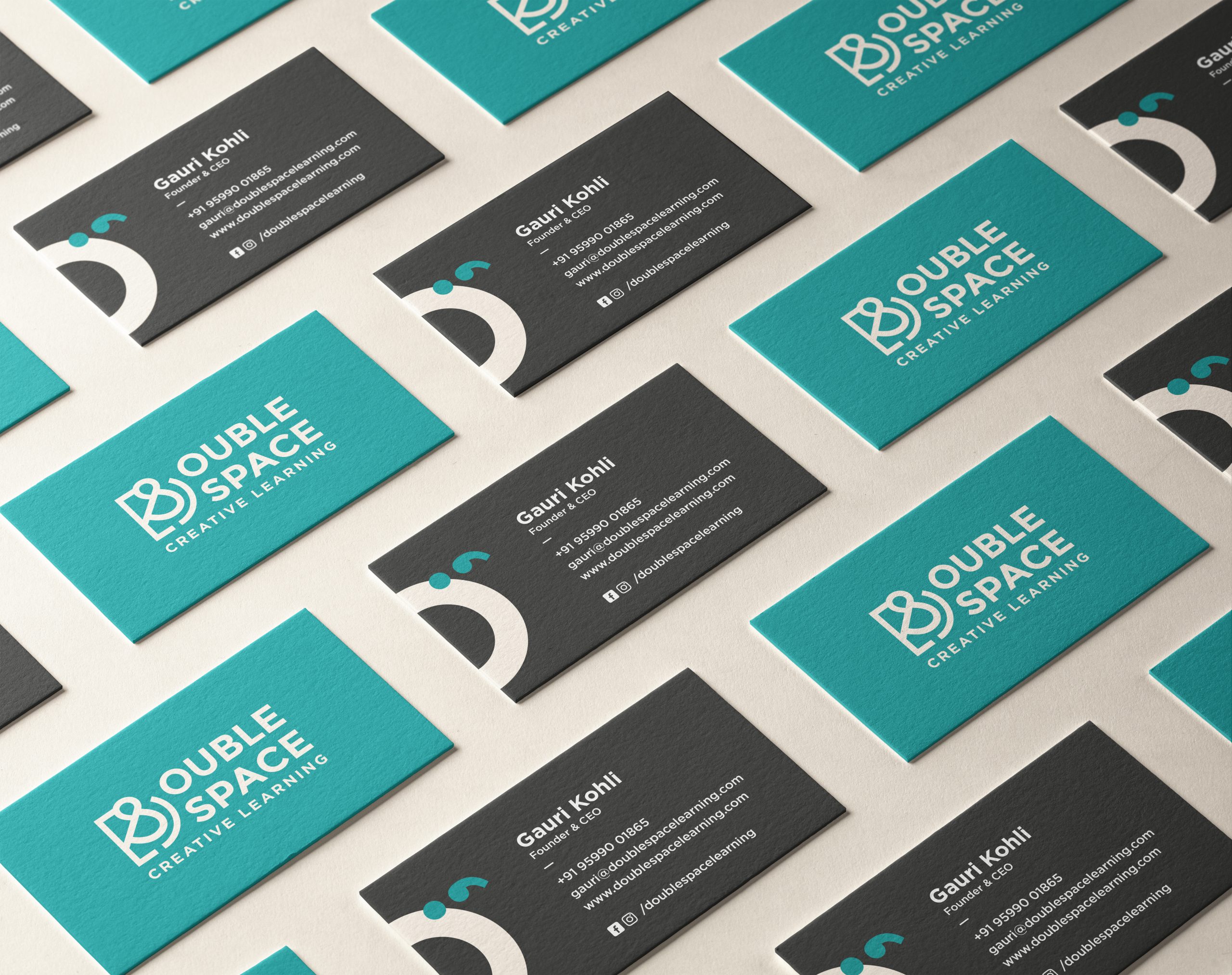
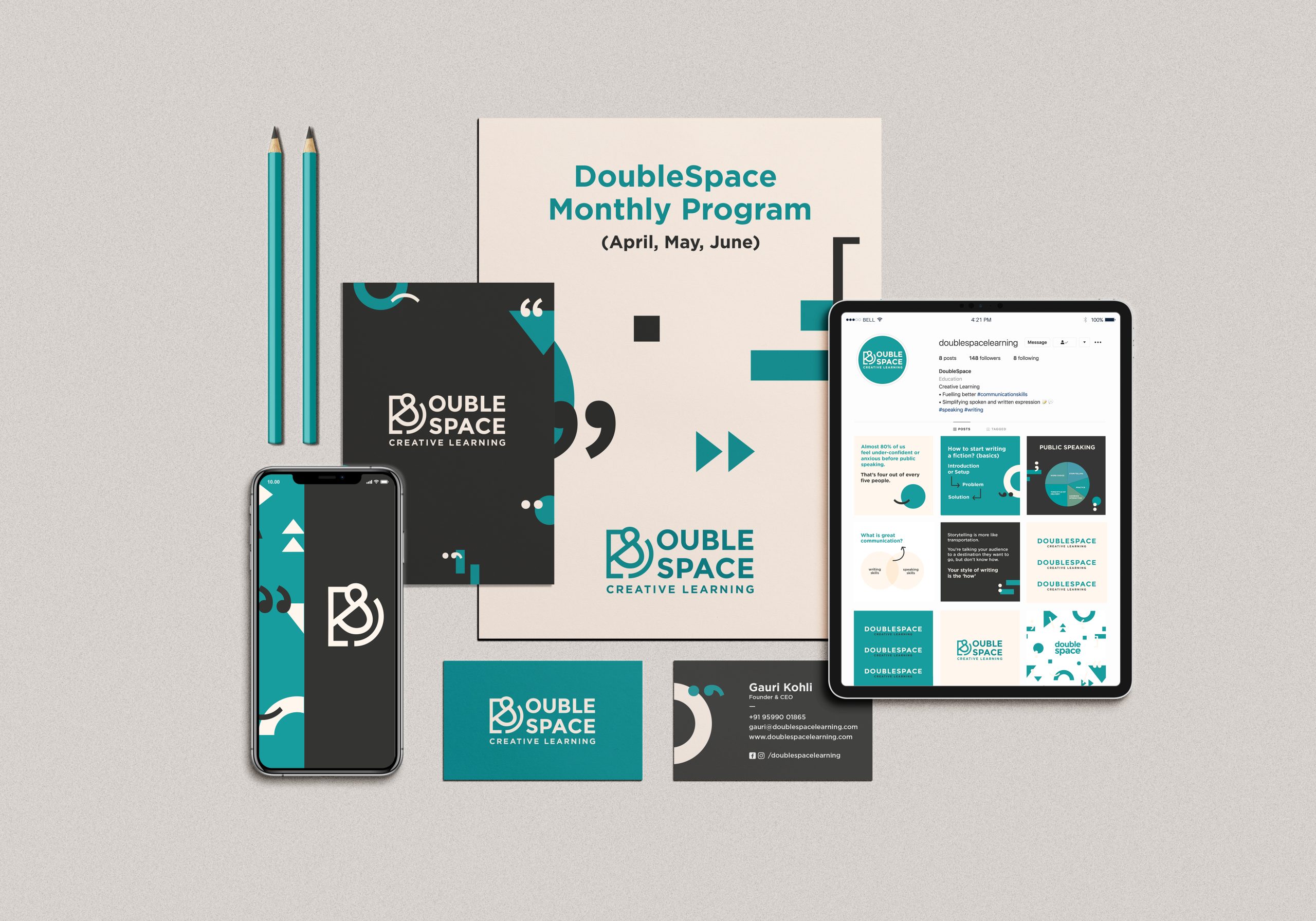
Using these elements, we created a strong visual guideline for the brand that was used across the brand collaterals and touch points.