
Cheviot Company Ltd.
Client: Manufacturing and Industrials
Scope of work: Brand Strategy, Brand Identity and Communication Collaterals
Industry: Pharmaceutical & Health
Formed in 1879, Cheviot Company Ltd is an Indian manufacturer, supplier, and exporter of jute yarns and fabrics. They wanted to refresh their old brand identity and build a new, sophisticated, and relevant brand presence that resonated with their standing as one of the top five jute industries in India.
Keeping the company culture and beliefs in mind, we redesigned their brand language to make it align with their future vision.
Challenging as it initially seemed to renew the branding elements while restoring its integral components, it was an interesting process to study Cheviot’s core values and brainstorm on ways to depict them visually.
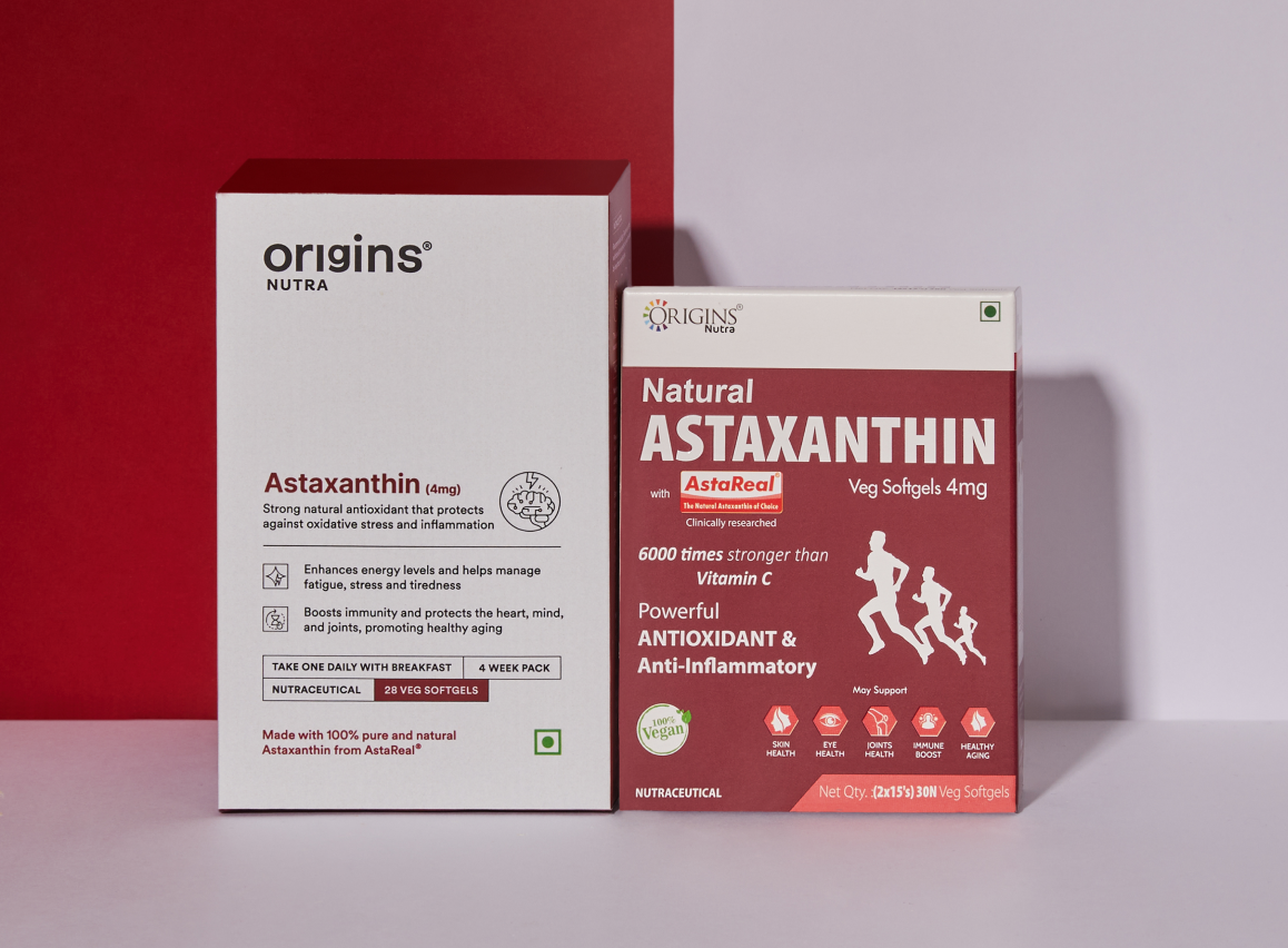
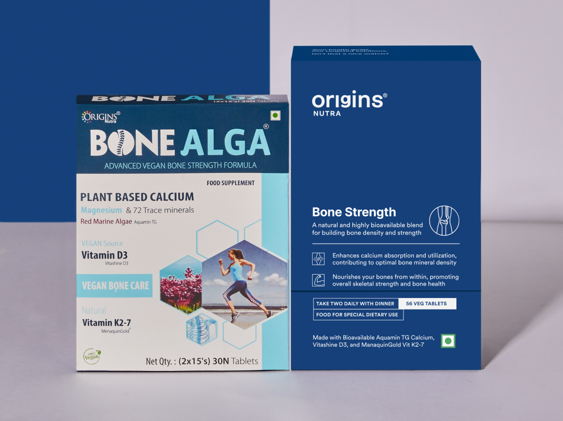
BEFORE AND AFTER
Understanding The Category
(product, brand, market, pricing and positioning)
Surya had enough evidence and clinical studies to show the product efficacy. The products really were making a difference in people’s lives. However, it wasn’t clearly communicated to the consumers. Consumers were not convinced, left confused and were doctor/nutritionist dependent (which was worse).
To solve this, it was important to first understand the market segment, how the product is made and who it caters to. Finding the right market fit and the target audience and consumer pattern was most crucial for the new brand – Origins 2.0
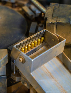
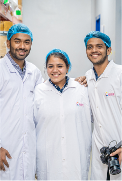
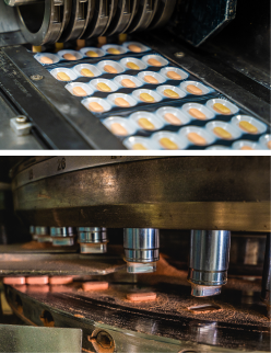
We spoke to multiple individuals to understand their relation with health and lifestyle. Our study findings were quite surprising giving the age and world we are living in. With abundance of unverified information, low barrier entry to the market and not finding a trusted sources, people have lost faith.
People think falling sick after a certain age is quite normal.
They believe in medicines and not supplements and you should only treat something if required and not add anything extra.
It’s overwhelming and people don’t know how & where to start.
People are doctor dependent and can’t make a decision on their own. They feel they will do more damage than improving it.
It seems gimmicky. No trust in the new age brands.
People don’t believe supplements are effective. They don’t trust the new brands so they hesitate in taking the first step.
Everyone is trying to make supplements fun and easy. Trust me, this was our first thought too (medicines are mundane) But, health is not easy or fun. Falling sick is complicated and emotionally hard. So, it need to be serious and direct that communicates correctly.
Why are we really doing this? Why do we exist today?
People are unaware of what goes inside their food and are surrounded my incorrect facts or half truths about supplements.
We wanted to simplify things but not compromise. We want to do it right, for you.
How are we doing this? How are we making a difference?
By questioning everything we do. From the need, to the product form, to the manufacturing process, the ingredients and the end product.
Our products are the mix of nature (herbs, minerals, plants, flowers) and modern nutritional science.
What are we doing? What is different about us?
We are a natural, clinically proven and researched supplements brand specialising in efficient healthcare, backed by science.
We are making healthcare simple so that you understand why and what you are getting into.

To live in a world, where people are not afraid to question their health goals – what they are made of and why you need them.
A brand that helps you make informed choices about your health and wellbeing. Know what, why and how of everything.
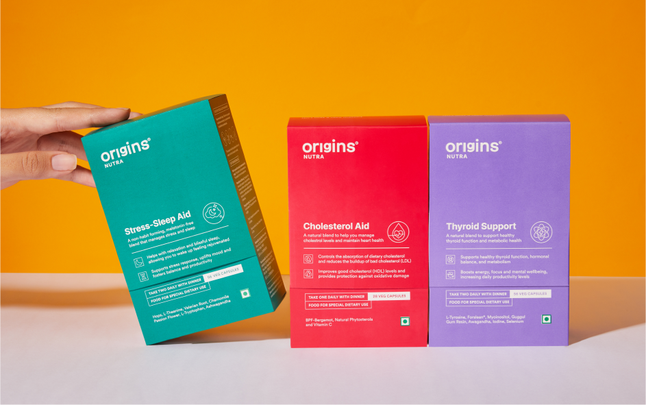
Introducing the all new Origins Nutra 2.0
Origins Nutra is a a guide, a coach who is here to truly help. And like all good coaches our job is to give you unsolicited, raw, and trustworthy solutions which is why our tagline is – It starts with you.
Introducing the all new Origins Nutra 2.0
Origins Nutra is a a guide, a coach who is here to truly help. And like all good coaches our job is to give you unsolicited, raw, and trustworthy solutions which is why our tagline is – It starts with you.
Introducing the all new Origins Nutra 2.0
Origins Nutra is a a guide, a coach who is here to truly help. And like all good coaches our job is to give you unsolicited, raw, and trustworthy solutions which is why our tagline is – It starts with you.
Everyone is chasing a health goal in their life that’s just how we humans are – eating better, moving more or losing weight. But being healthy or reaching that goal is not easy. It’s hard, complicated and intimidating.
So, it was important to shift the mindset – Changing the narrative from being a supplement brand to a health coach. This led us to position ourselves as a coach/ mentor. A coach that gives your raw, unsolicited advice and guides you through your journey.
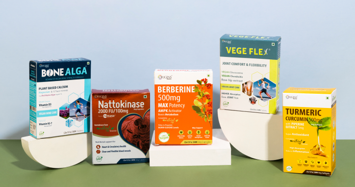
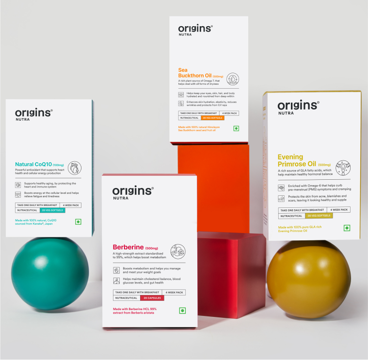
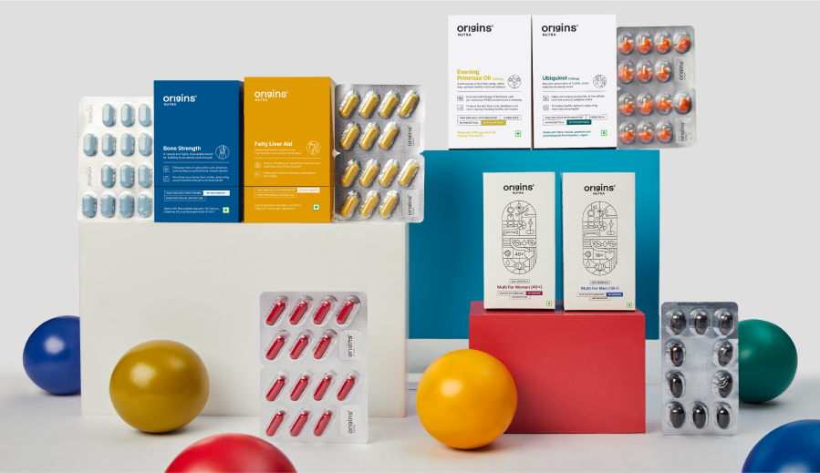
The Entire Range of Products are divided into three categories – Daily Essentials, Targeted Blends, Single Ingredient
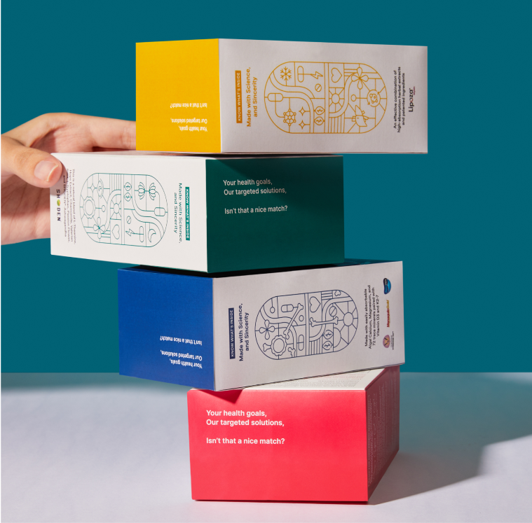
Consumers always had this one question – What is inside this pill/ What is it made out of?
We built the entire brand on the basis on what’s inside the pill since everyone is skeptical about adding anything extra.
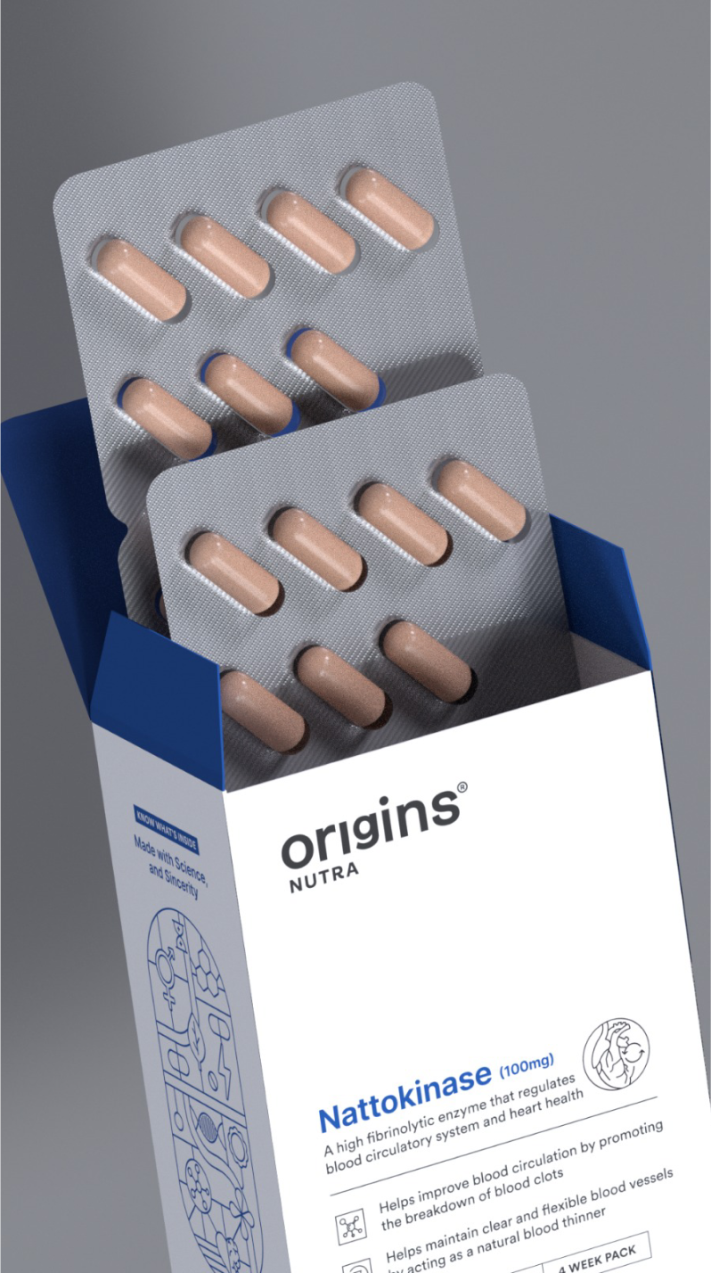
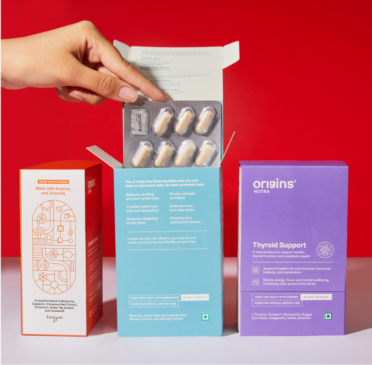
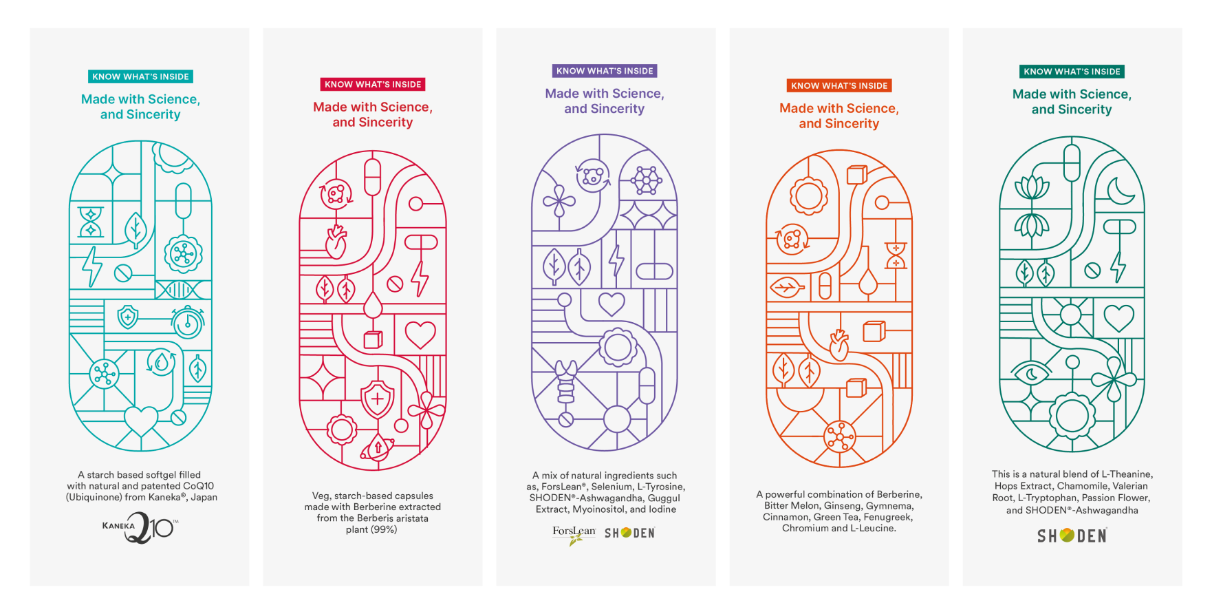
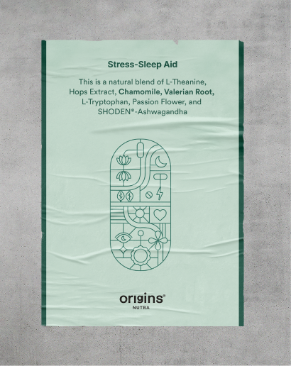
Each Illustration is a combination of benefits, ingredients, brand values and product details in the shape of a pill (there is a reason why we used pills)
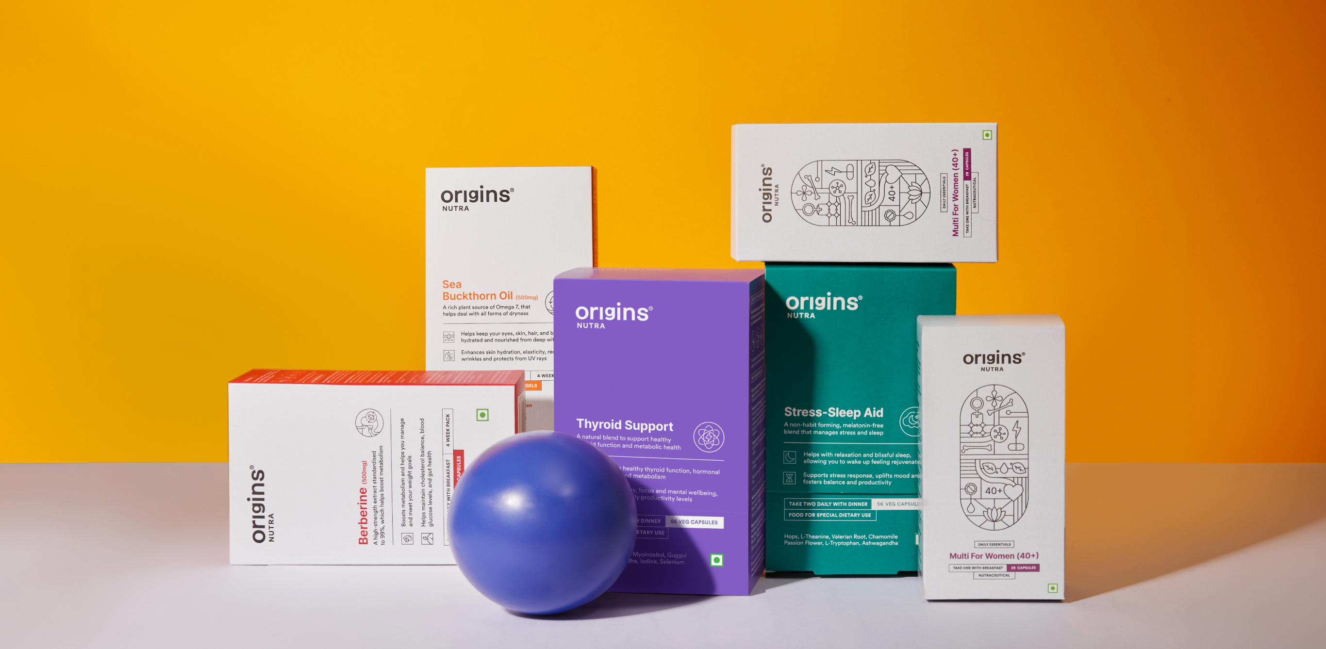
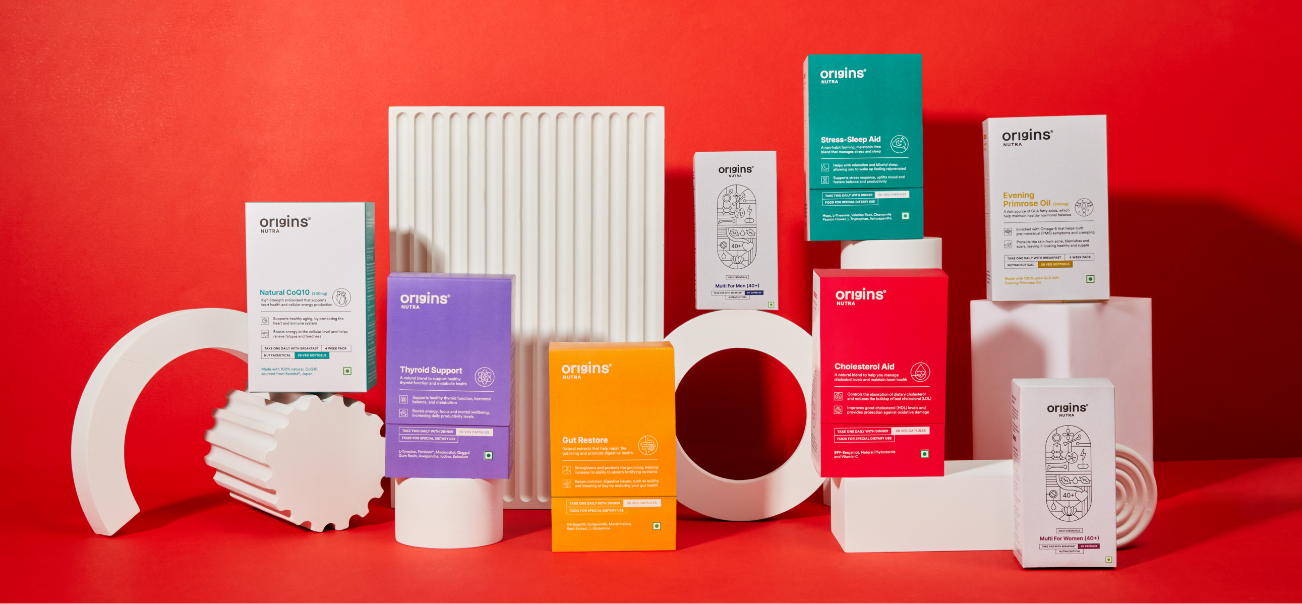
A pill with a different arrangement and colour palette put together to represent the different products for the brand.
We built the entire brand on the basis on what’s inside the pill since everyone is skeptical about adding anything extra.
Each Illustration is a combination of benefits, ingredients, brand values and product details in the shape of a pill (there is a reason why we used pills)
A pill with a different arrangement and colour palette put together to represent the different products for the brand.
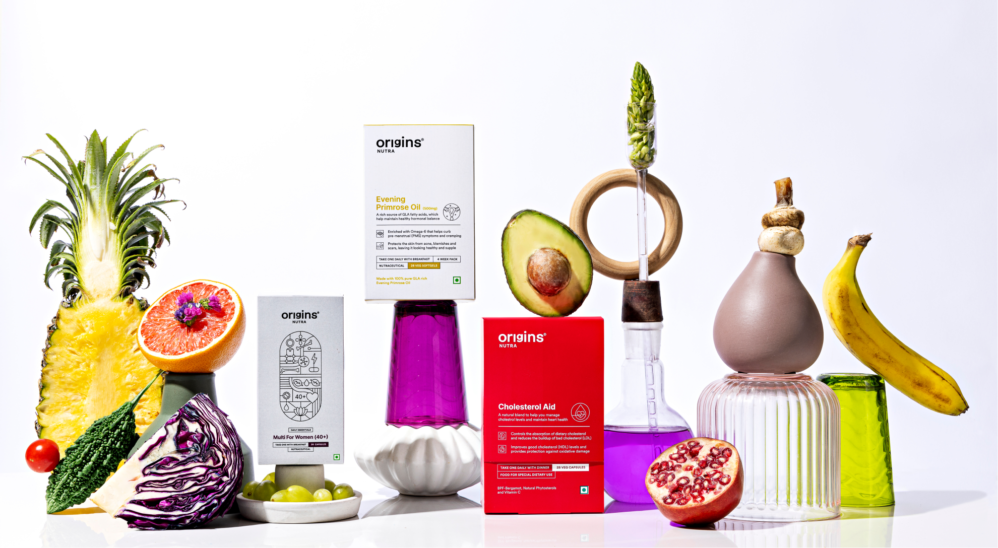
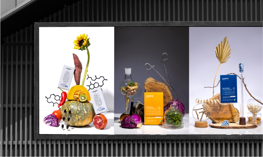
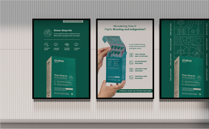
Origins is a beautiful balance of Nature and Science.
All the products use unique, certified and 100% natural certified ingredients from the nature that are put together in a capsule, for you to consume it in the best form.
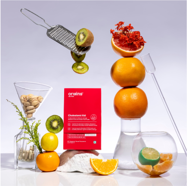
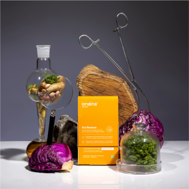
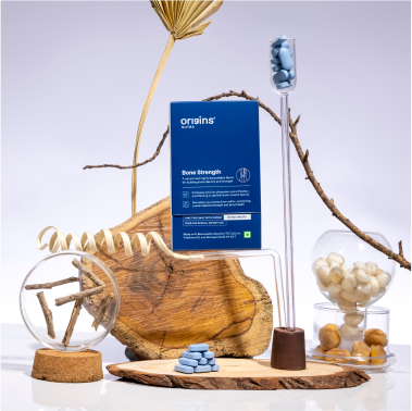
We wanted to go a step beyond and make the box a lot more detailed and add a lot more value to the entire experience for the customer. A new journey is overwhelming, so the goal was to make this as simple and as easy as possible.
The First Layer: The products arrive in a brown corrugated box that opens to a founder’s note that and a brochure that talk about How to start this journey.
These collaterals were added to set the right expectation and get the maximum output.
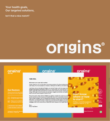
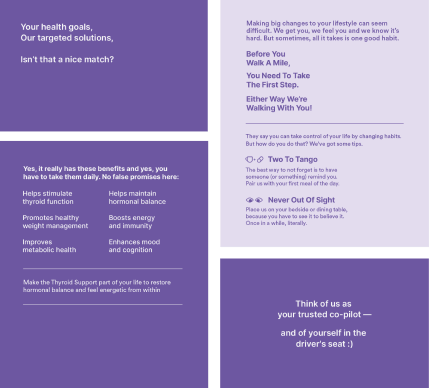
The Second Layer: As you open the box, we talk about habit formation, power of being consistent & added tips to make forming an habit easier. We also stated the benefits clearly to make sure you know what to expect from the product.
The overall communication was how a coach would speak to you to make you more disciplined, accountable and serious.
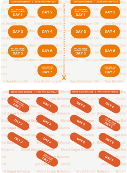
The Third Layer: The pill strip is what stays the longest with the consumer – we divided it day wise
& added some positive affirmation.
We also add colour and product name to easily identify the strip.
We designed the website like a brick-and-mortar store. Once you walk in the Origins store, it’s important to understand not just the product but a lot of other things. Use code STUDIO CC for a special surprise if we made your decision easier to start your health journey using Origins. So, few things we added:
- Health is a complicated journey, so we wanted to address it by doing how to start page that helps you understand how to go about the start journey. We also curated test that asks you the right questions to help you find the right product.
- We also wanted to take through our entire process and list of ingredient so that it helps you understand what goes inside and how are they made. We have a process page and a Why Tablets page to answer any questions you might have regarding the product and process.

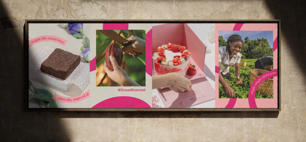
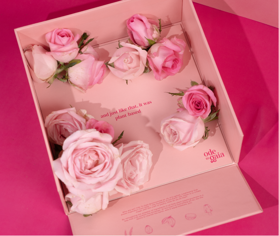
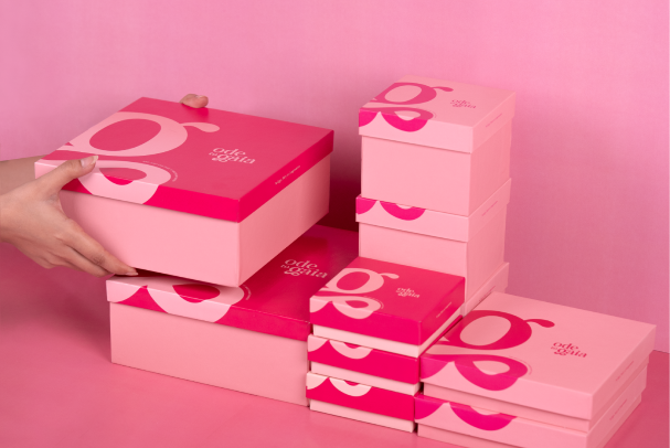
Desserts are like an escape from the reality. It is suppose to be a unforgettable indulgence and so no one wants to compromise on either the taste, ingredients, look or anything else. They want the full package. Consumers feel consuming plant-based food is a compromise, they feel that the taste is not the same and only people who can’t consume regular desserts opt for vegan ones.
But with Ode To Gaia, it wasn’t true. Infact, if consumers didn’t know that the product was plant-based they would have never guessed it.
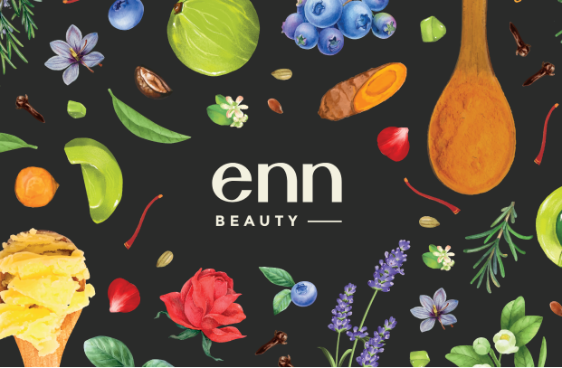
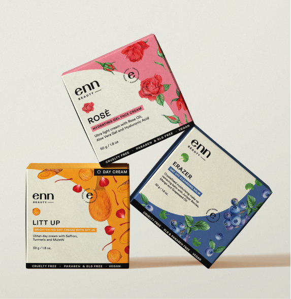
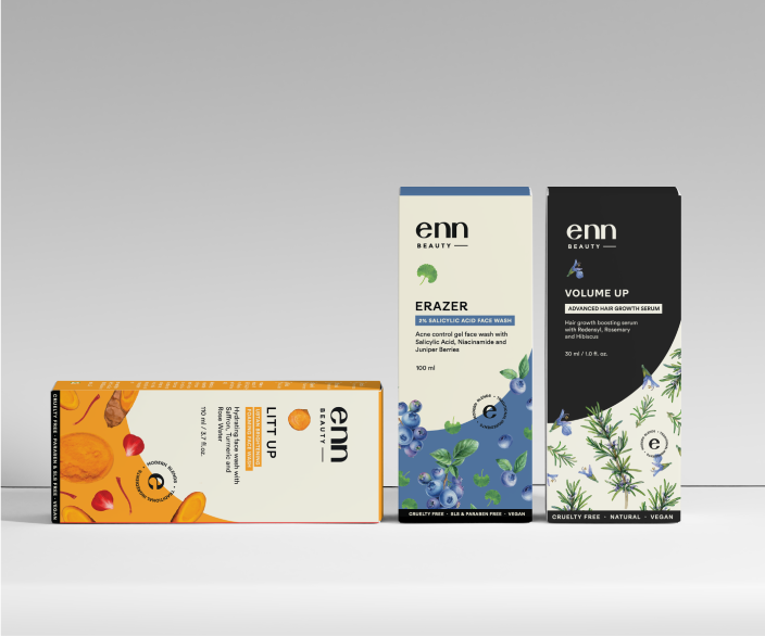
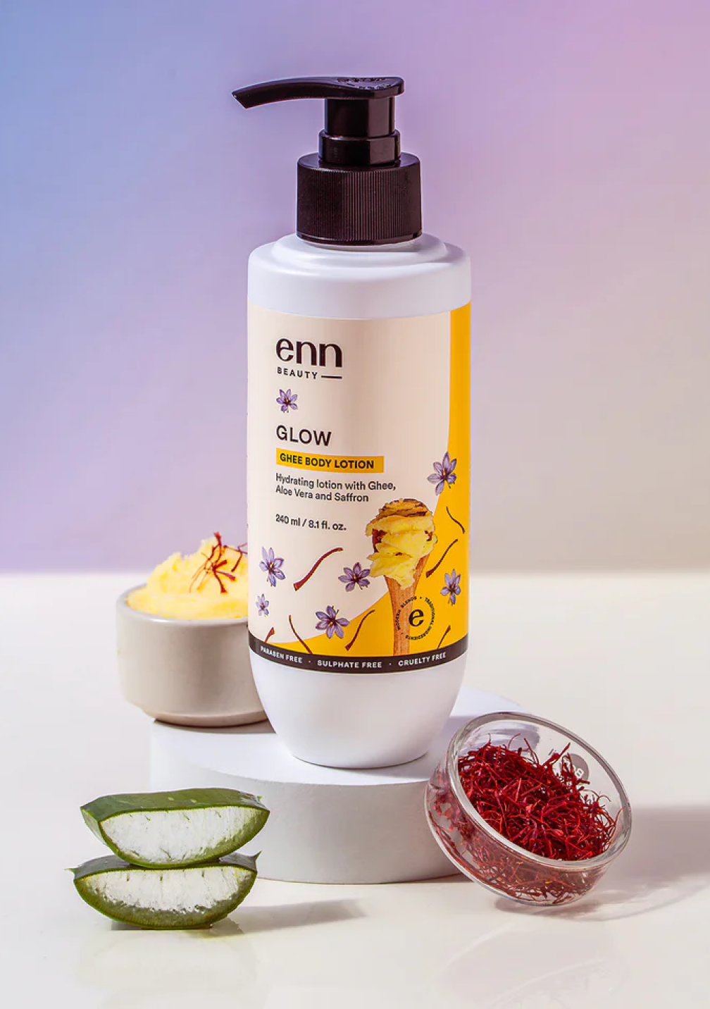
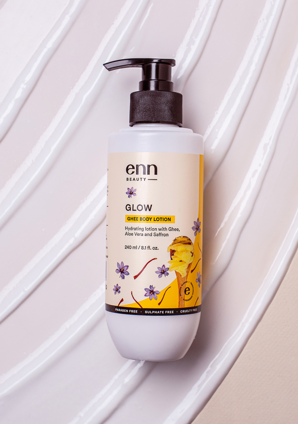
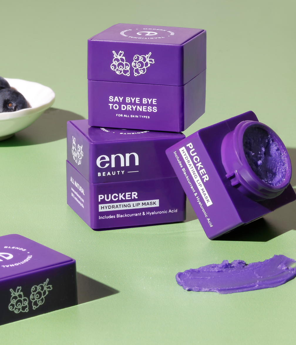
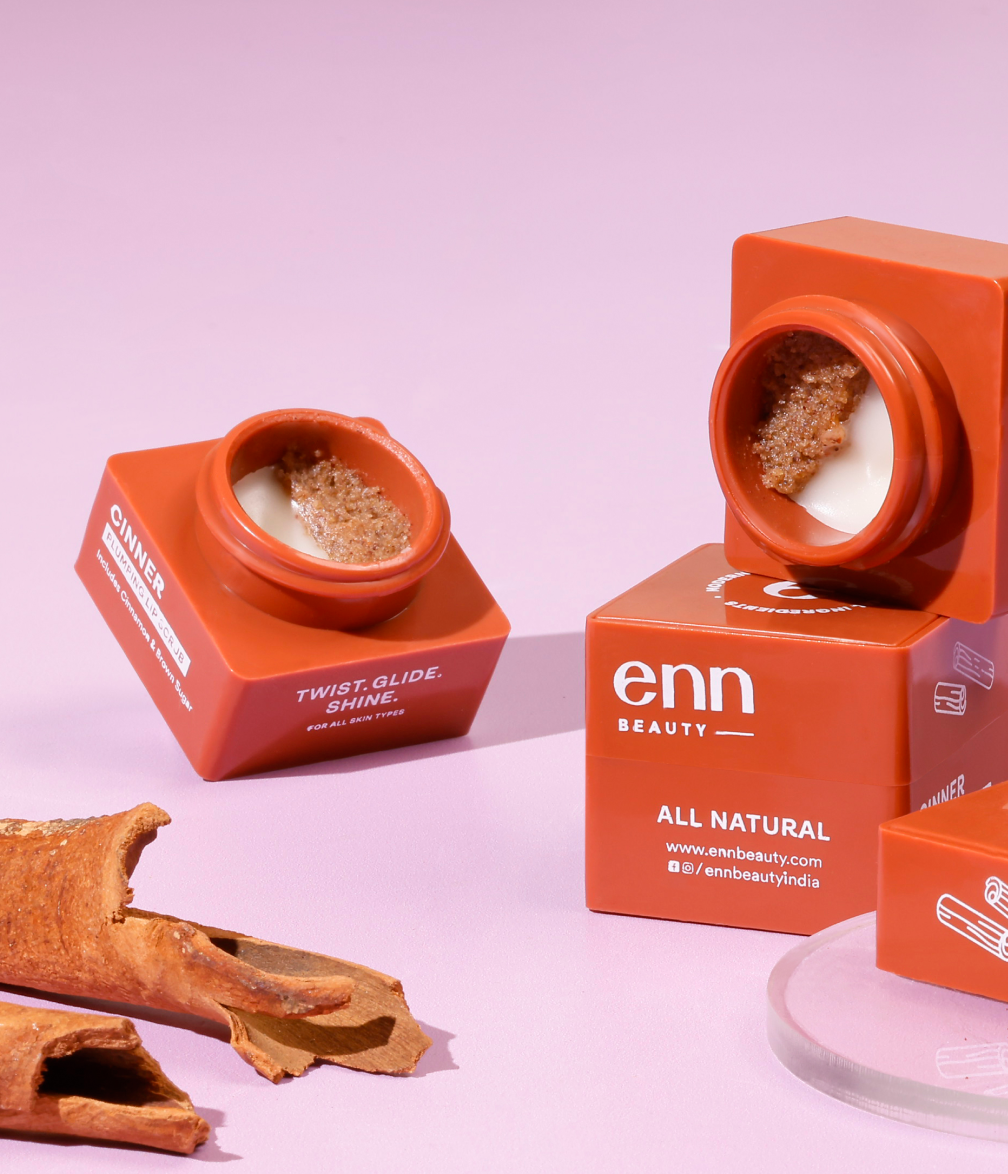
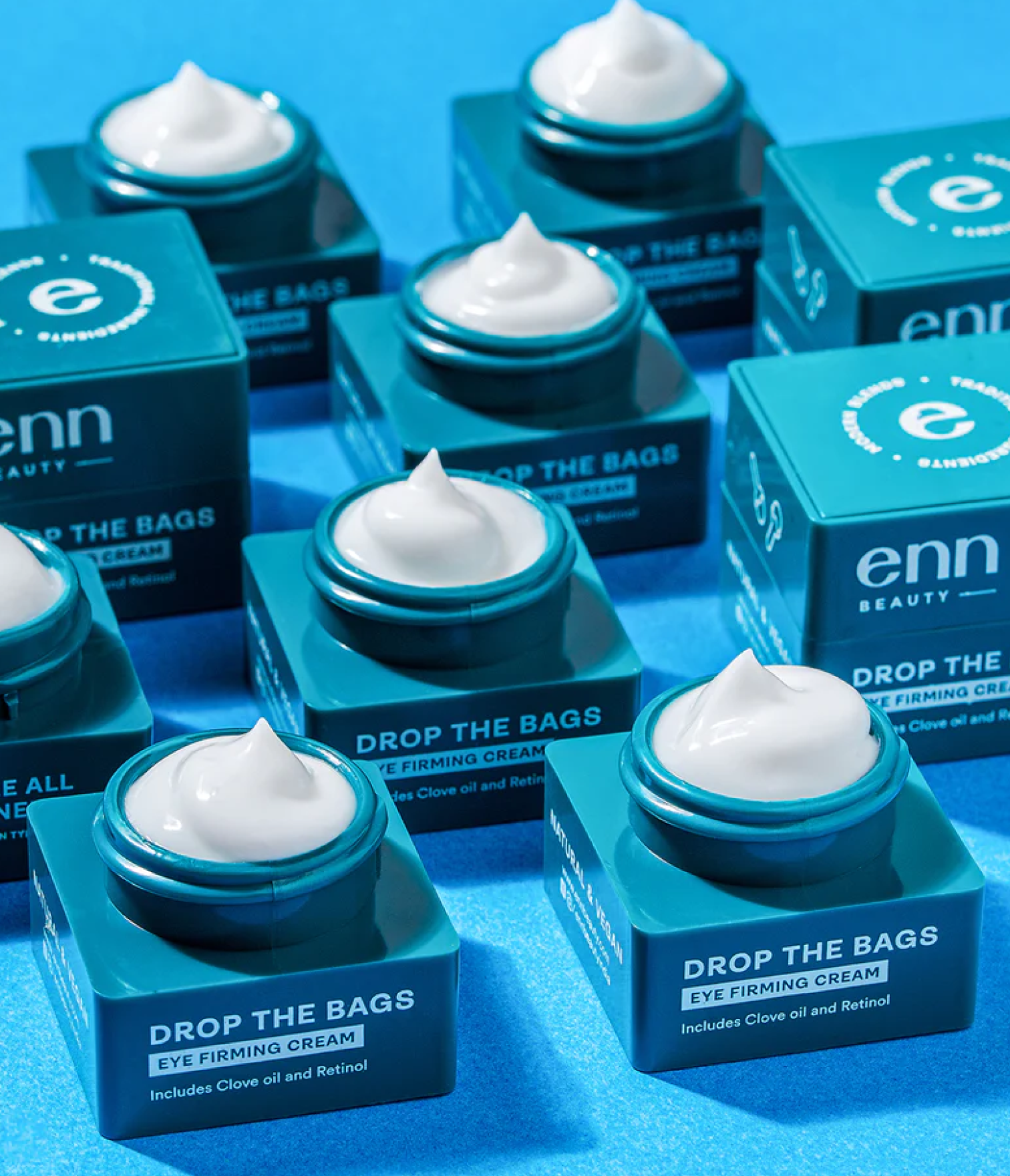
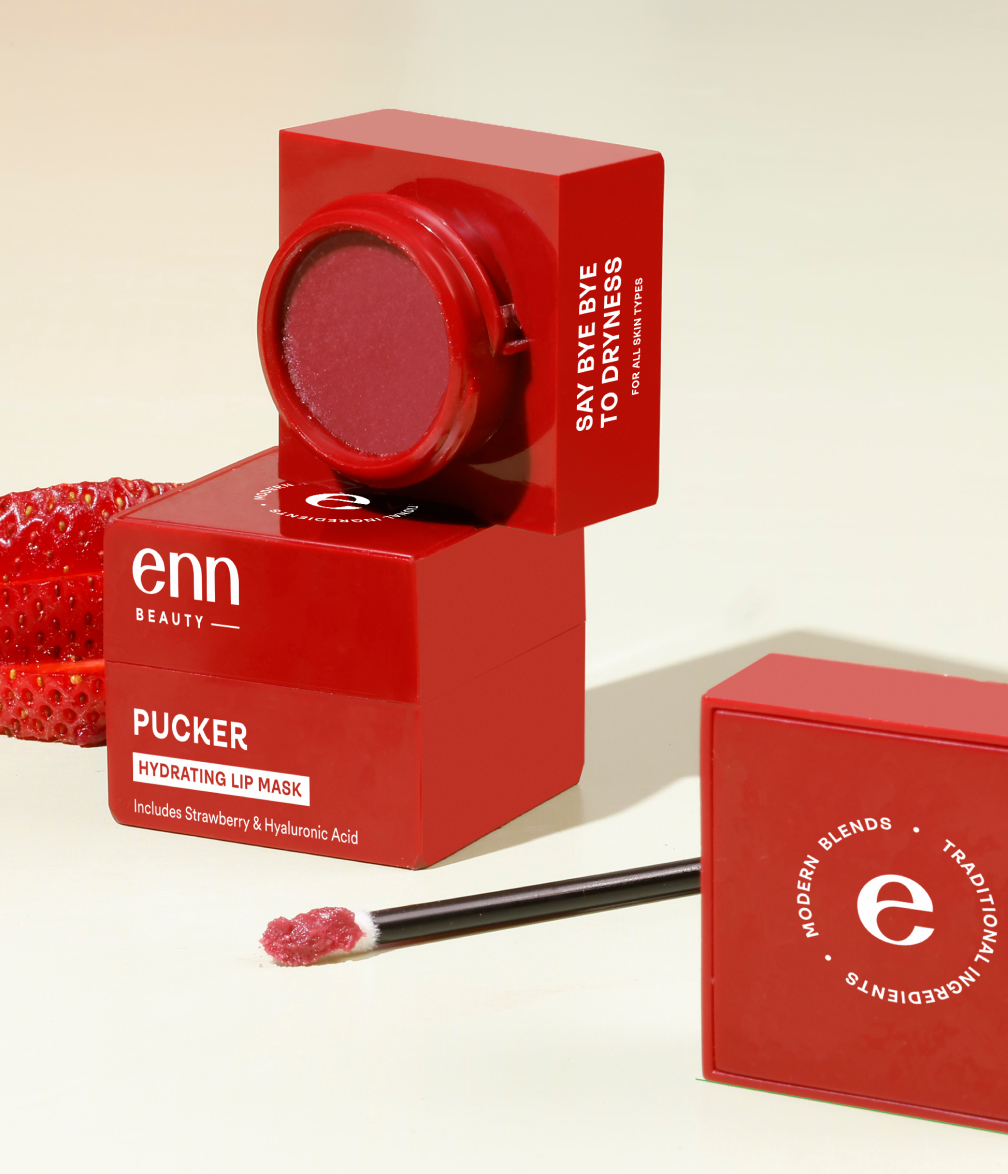
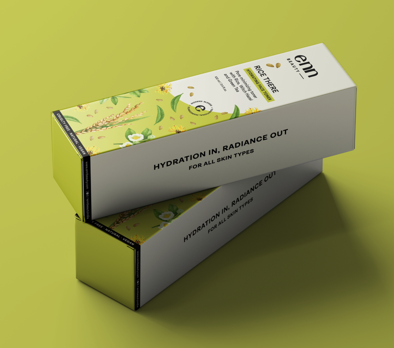
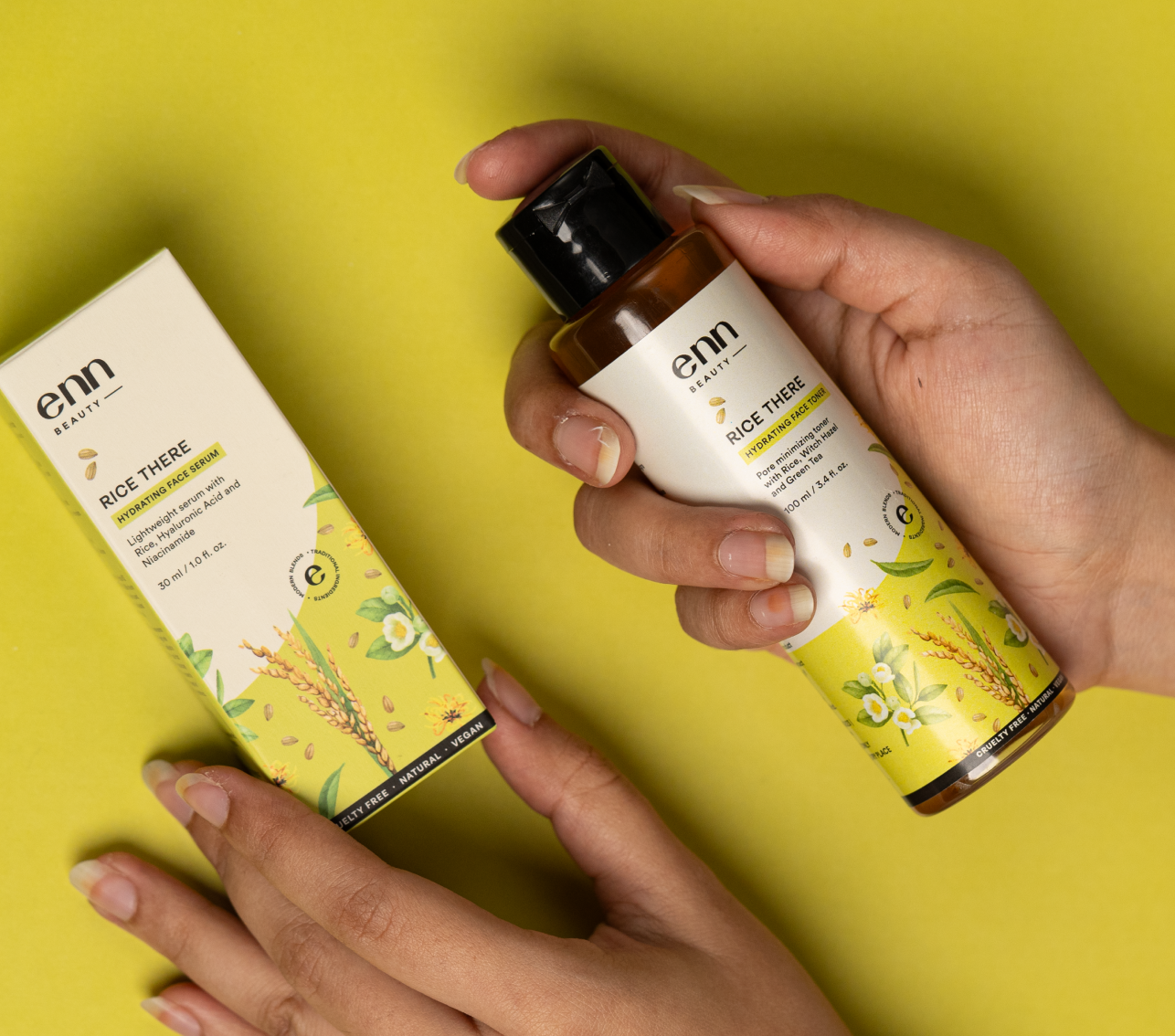
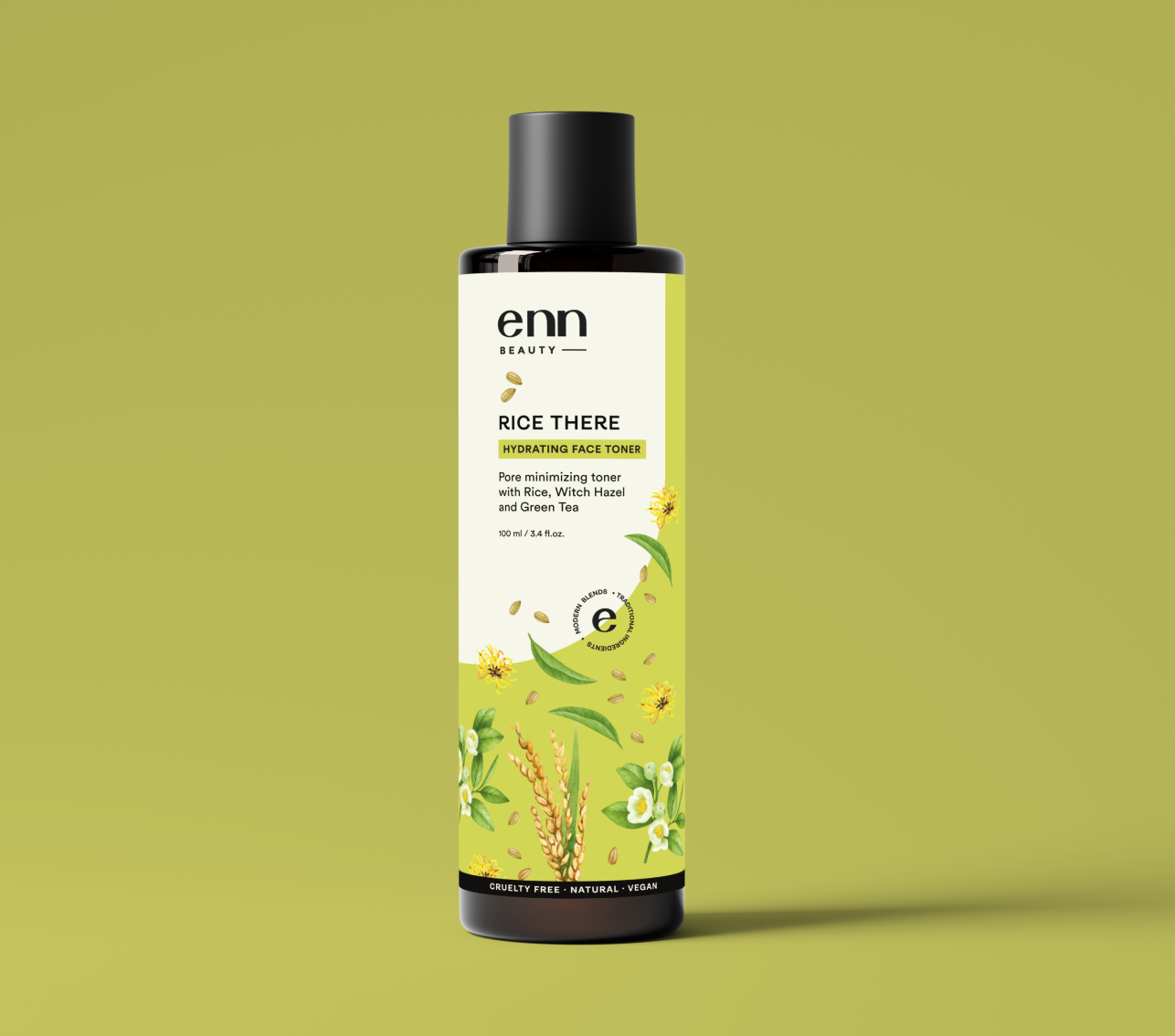
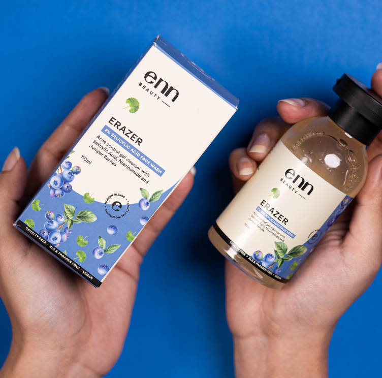
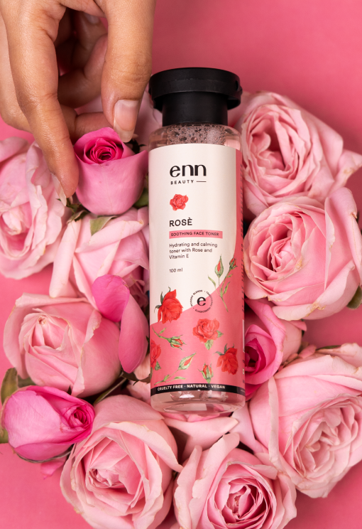
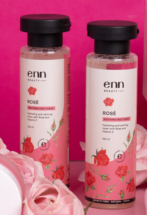
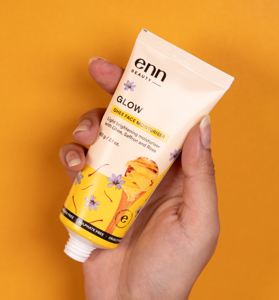
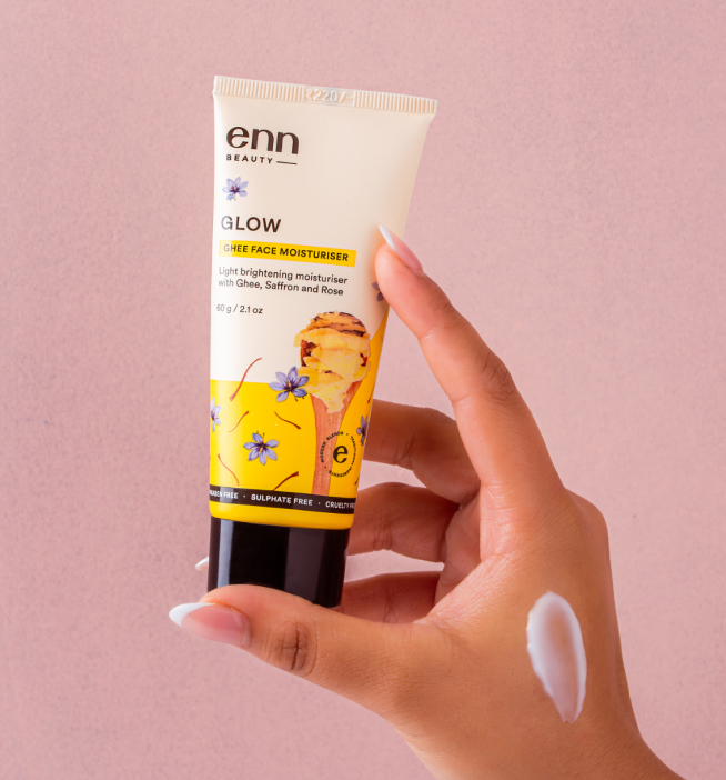
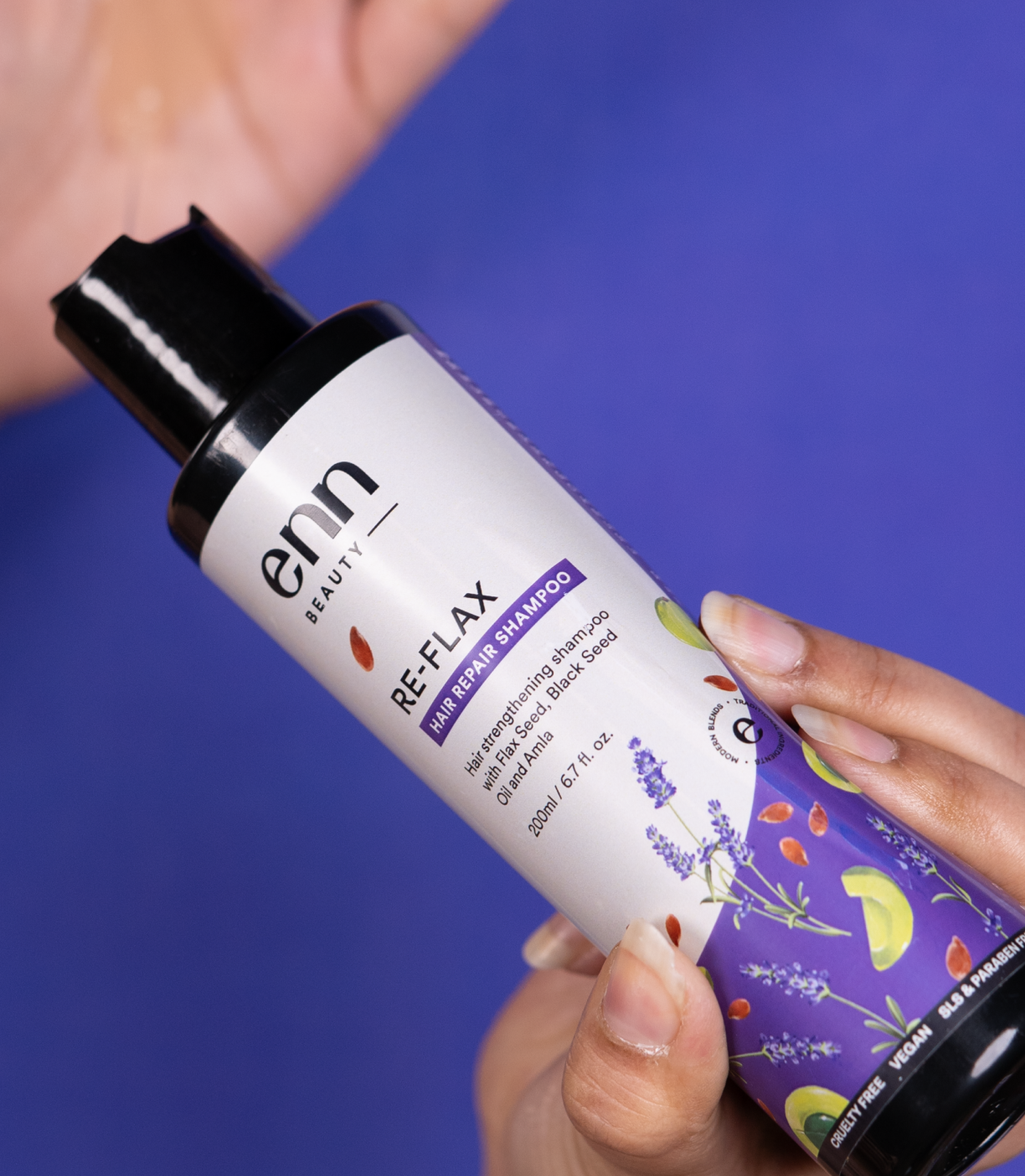
For Enn Beauty, Ingredients are the hero element. The product, the brand – everything was built around these illustrations. So, we complemented it with a clean, serious typeface with broad edges and simple curves
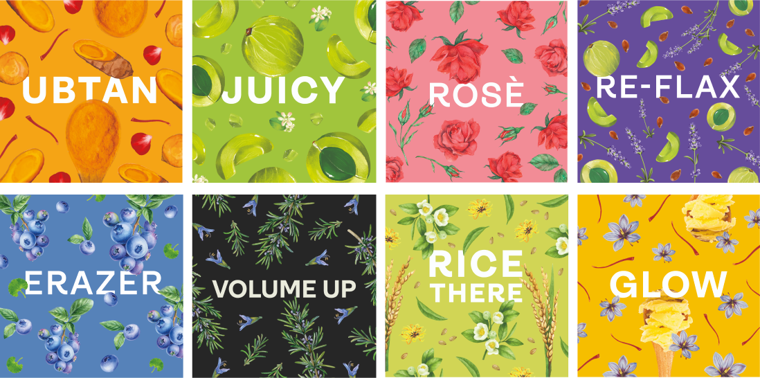
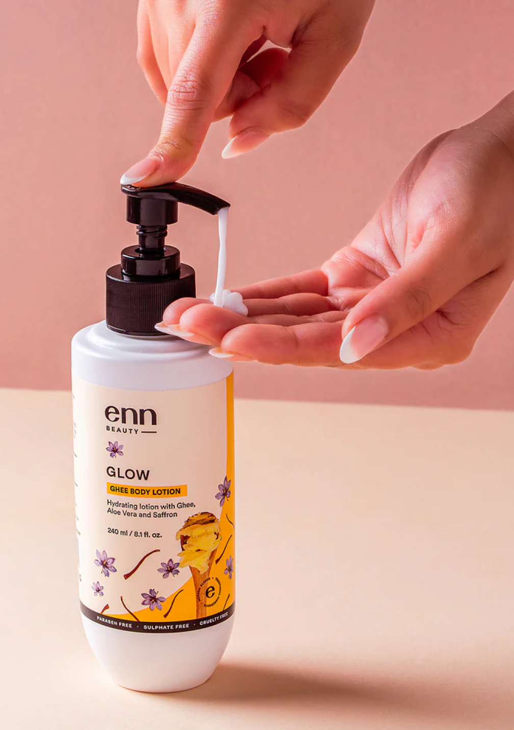
Enn’s products are divided into different ranges depending on the ingredient like (Amla is the Juicy Rage/ Ghee is the Glow Range).The design and brand is centred around these ranges that makes the brand not only fun but easy to remember and identify,
We built each category to look distinct, have an individual character yet have an overall synergy.
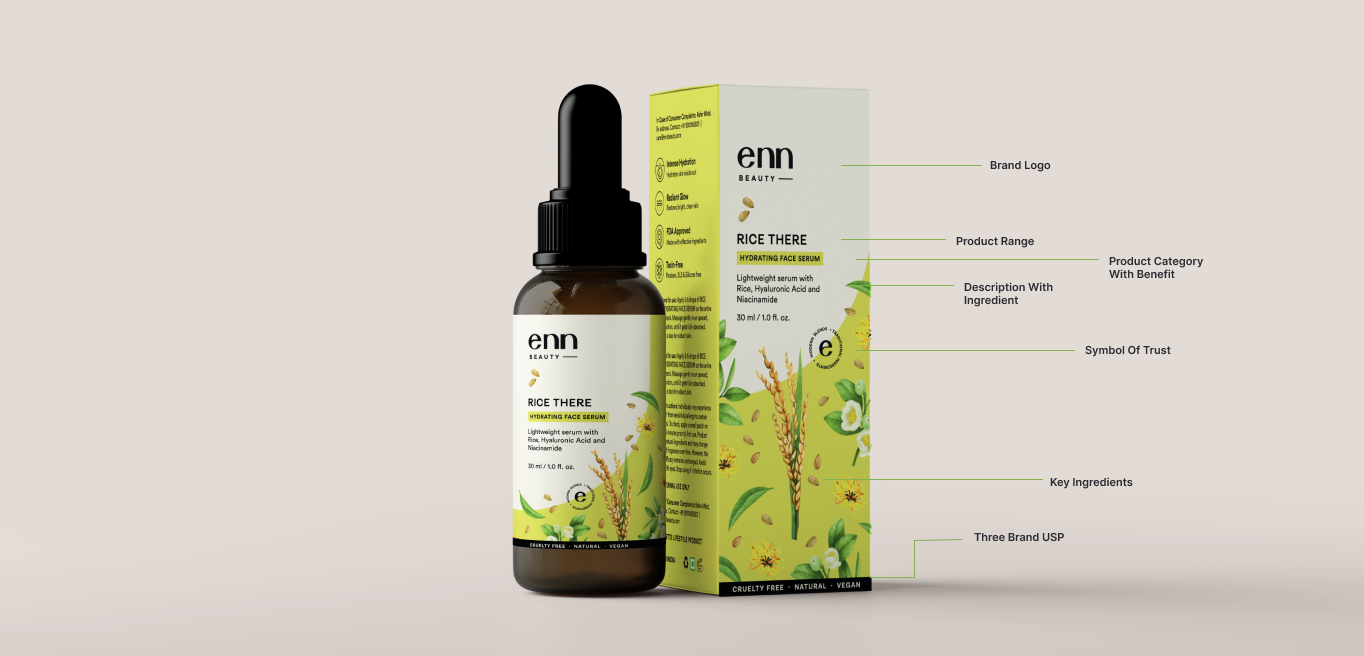
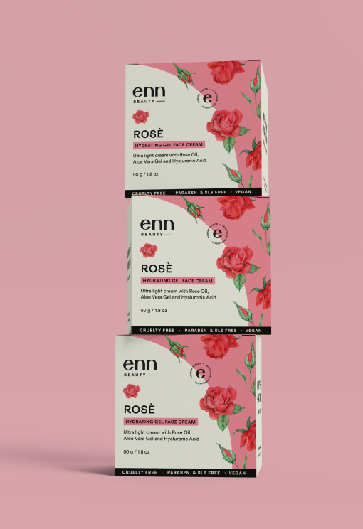
A brand that has infinite ranges from shapes, bottles, ingredients to products – it was very important to maintain a packaging system to make sure the brand stays intact.
We followed a clean, minimal design system to make sure it is easily adaptable yet impactful.
It really does take a village to build a brand like this
Strategy & Creative Director: Sejal Agarwal
Website Development: Big Bang Commerce
Lead Designer: Praneeta Gupta
Copy: Suman Quazi
Product Photography: Saurik Shah
Shivani Goel
Art Direction: Ria Punjabi Ankita Ajbani
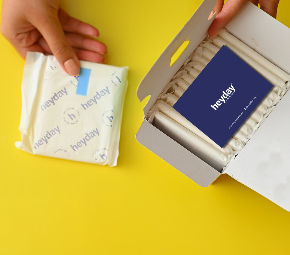
Working with Sejal has been exceptionally fulfilling. Not only does she understand
the essence of branding but she is able to marry her quirky design aesthetics with the what Heyday truly stands for. It’s been a pleasure to work with a highly motivated professional who connects with our brand beyond the scope of a project.”
– Nandeeta Manchanda, Founder of Enn Beauty