
Short, mini projects with up-and-coming exciting small businesses that allow us to be curious, experiment, do something totally that feed our desire to learn and explore, all while collaborating with adventurous brands that have the potential to change the world.
So, as a studio, we are always looking to work with small businesses that are here to redefine the industry and have some fun while doing it (okay, this time we are totally combining work and play)



Client: Gauri Kohli
Scope of work: Brand Strategy, Brand Identity and Communication Collaterals
Industry: Education and Learning
In today’s world of one too many modes of communication, DoubleSpace is a breath of fresh air. As a communication enhancer, they help you understand what to convey and when. Their mission is to combat the lack of communication in the Indian education landscape.
With the belief that all writing and speech can be made more effective when structured with the intention to spread a message, DoubleSpace required a branding language that communicated its own mission statement optimally. Our goal was to overcome the challenge of building a distinct visual identity for a company that centered around words and languages.
Through the brand language, we wanted to inspire the average Indian to be articulate communicators so that it would empower them to stand out from the crowd.


Client: Manufacturing and Industrials
Scope of work: Brand Strategy, Brand Identity and Communication Collaterals
Industry: Pharmaceutical & Health
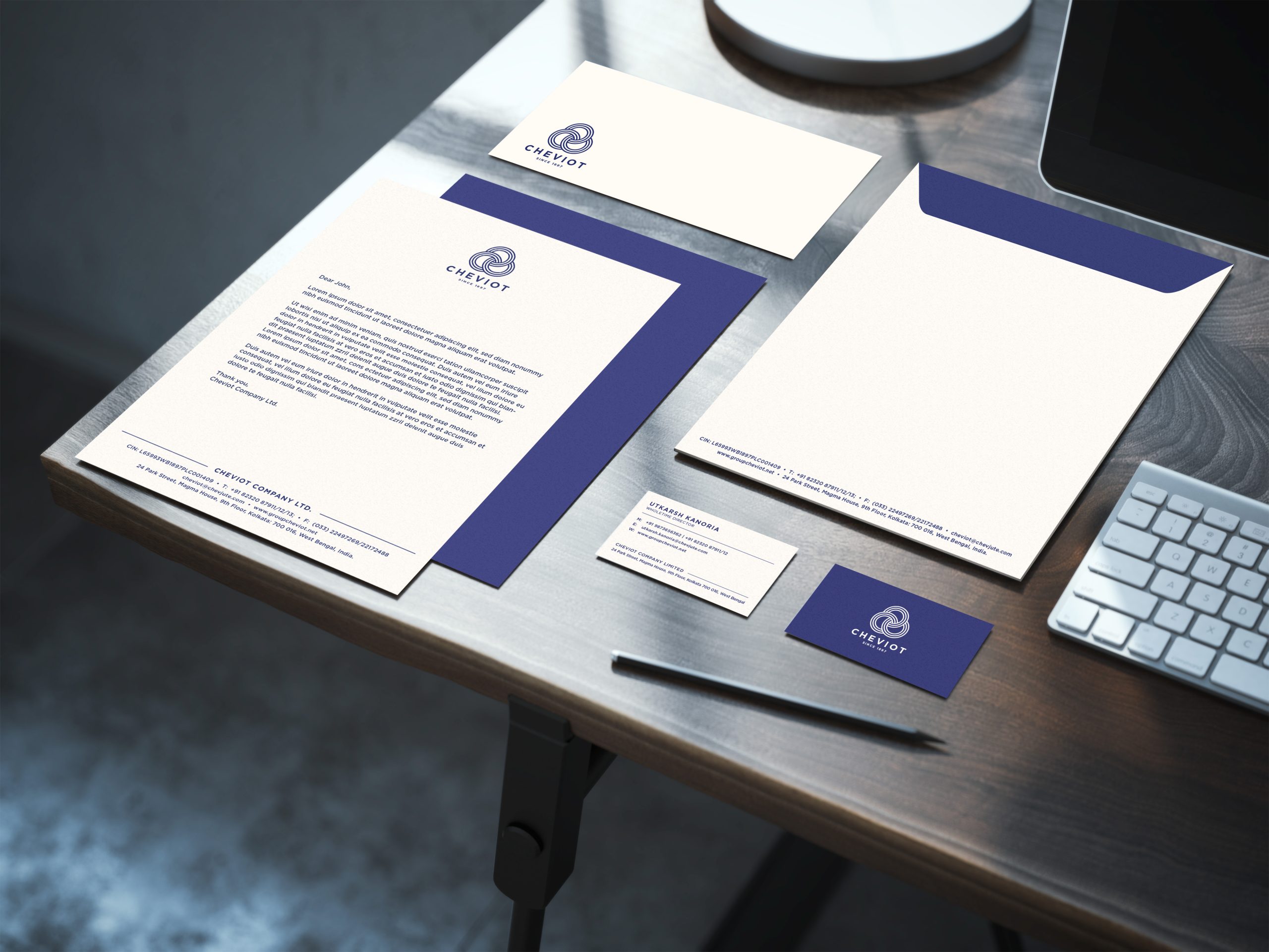
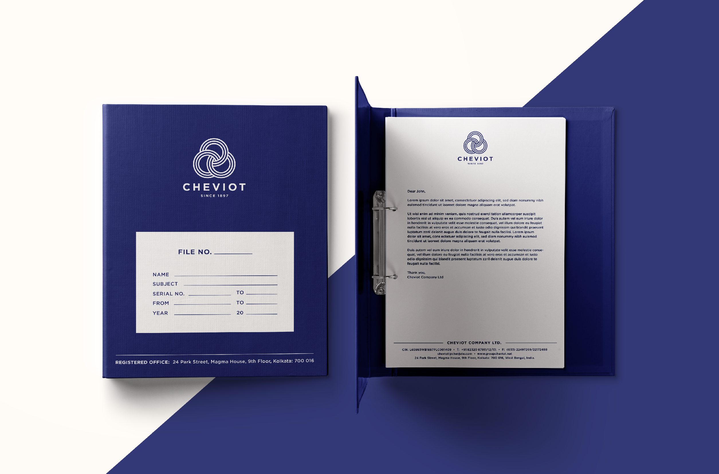
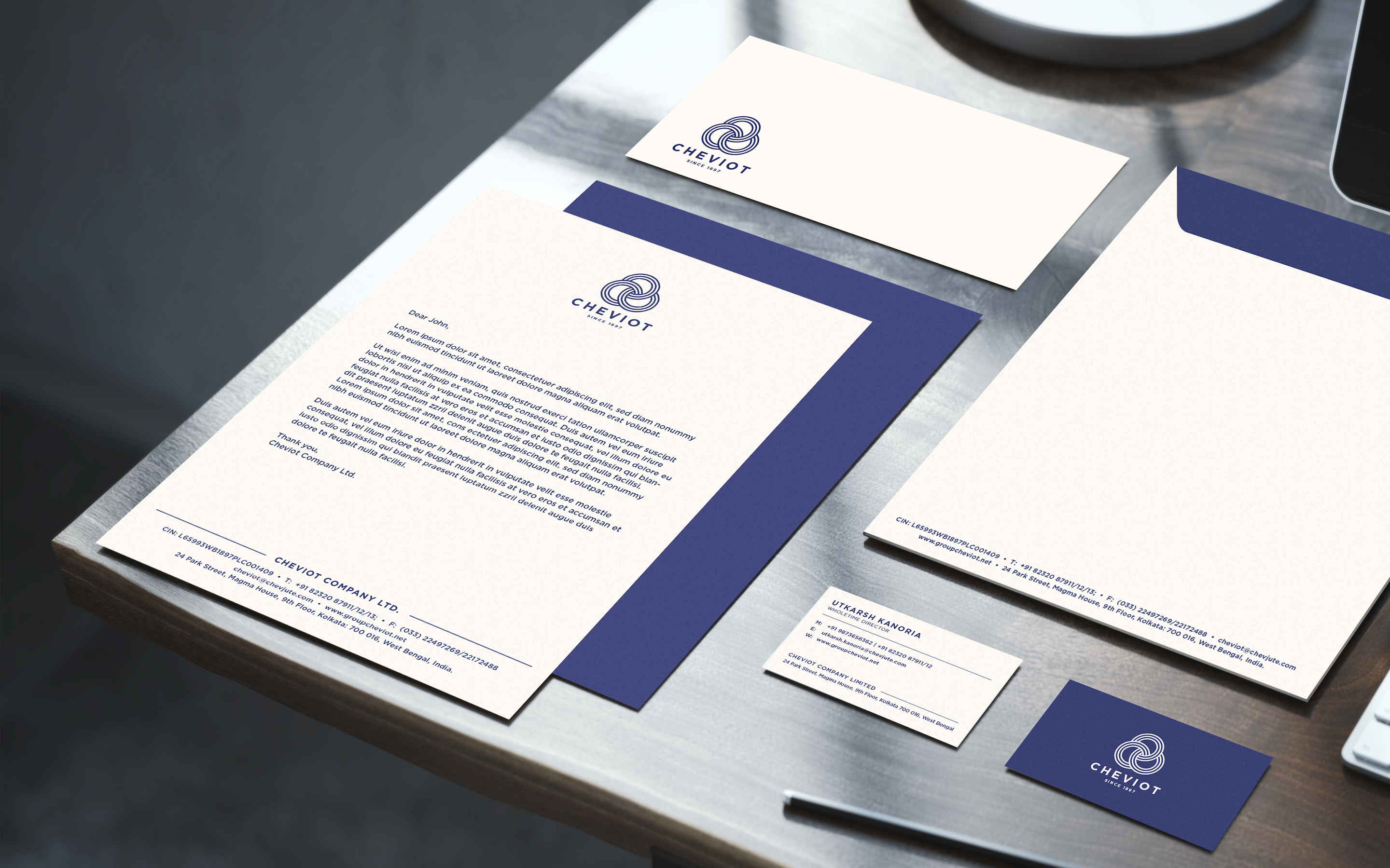
Formed in 1879, Cheviot Company Ltd is an Indian manufacturer, supplier, and exporter of jute yarns and fabrics. They wanted to refresh their old brand identity and build a new, sophisticated, and relevant brand presence that resonated with their standing as one of the top five jute industries in India.
Keeping the company culture and beliefs in mind, we redesigned their brand language to make it align with their future vision.
Challenging as it initially seemed to renew the branding elements while restoring its integral components, it was an interesting process to study Cheviot’s core values and brainstorm on ways to depict them visually.
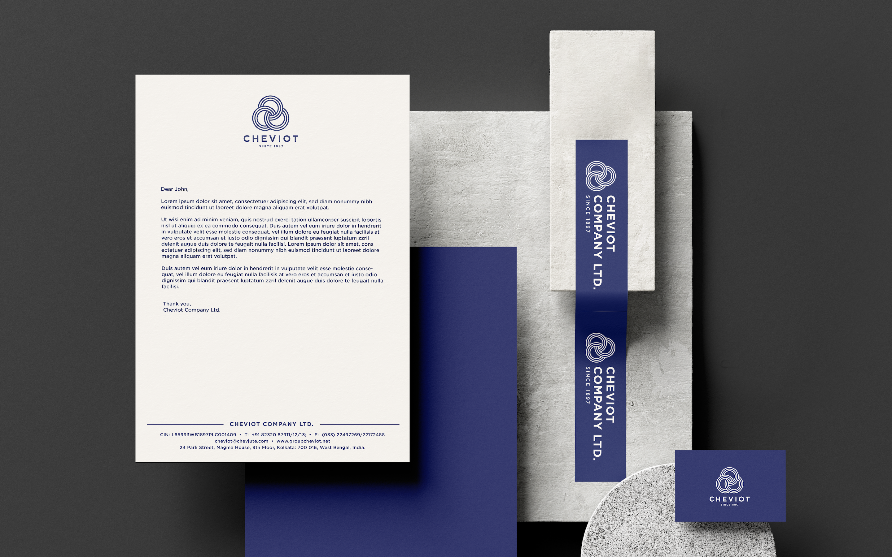
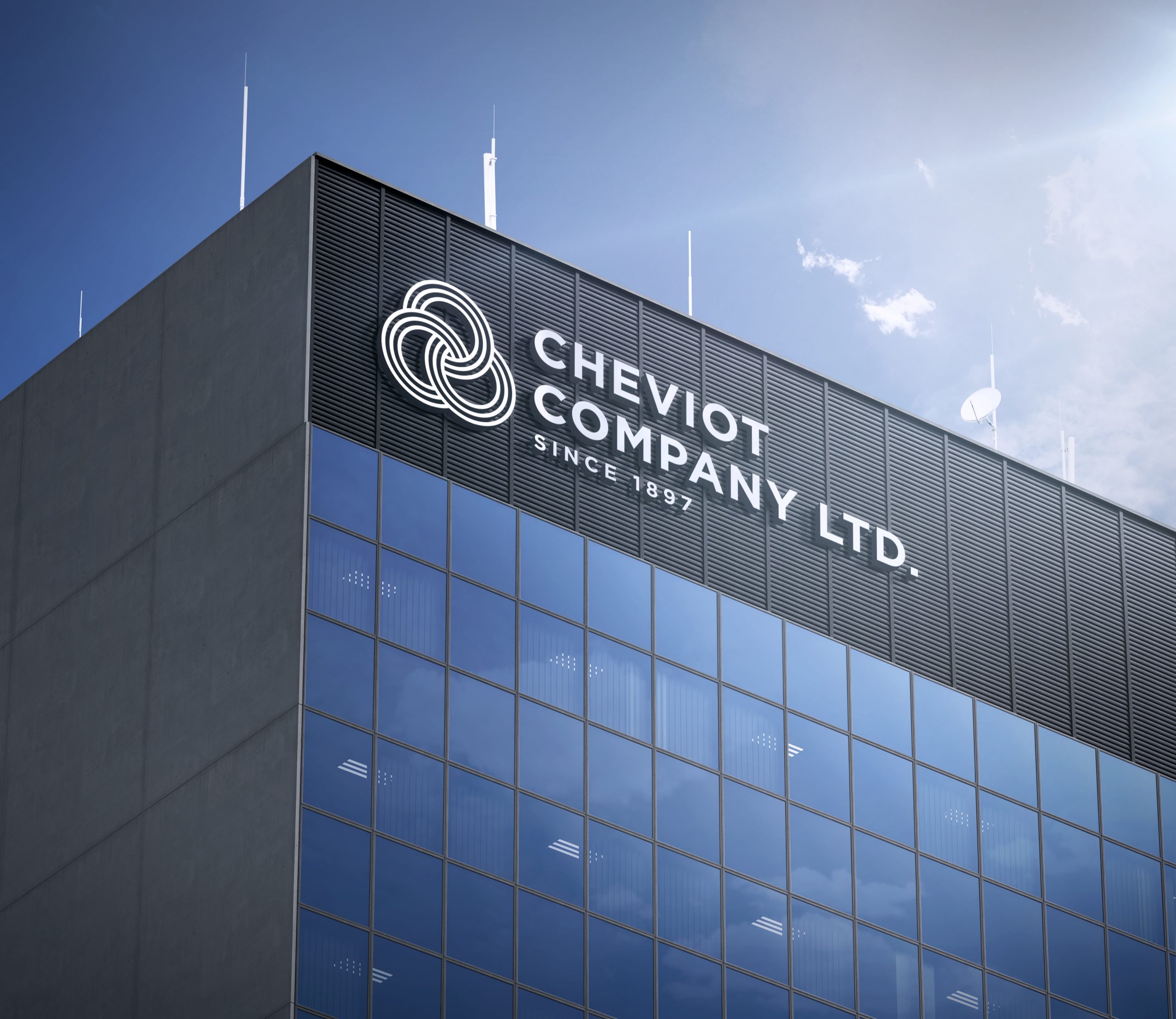
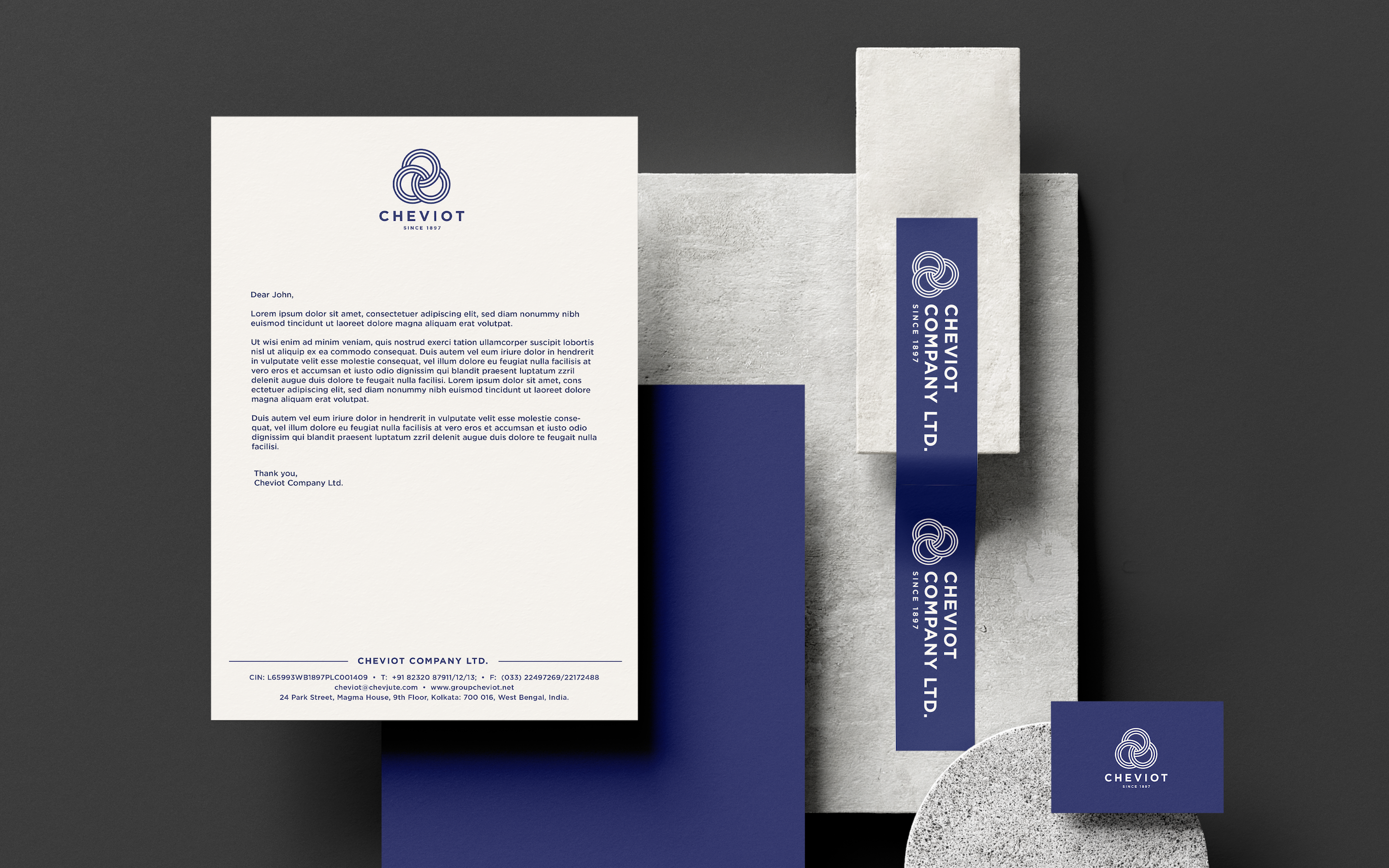
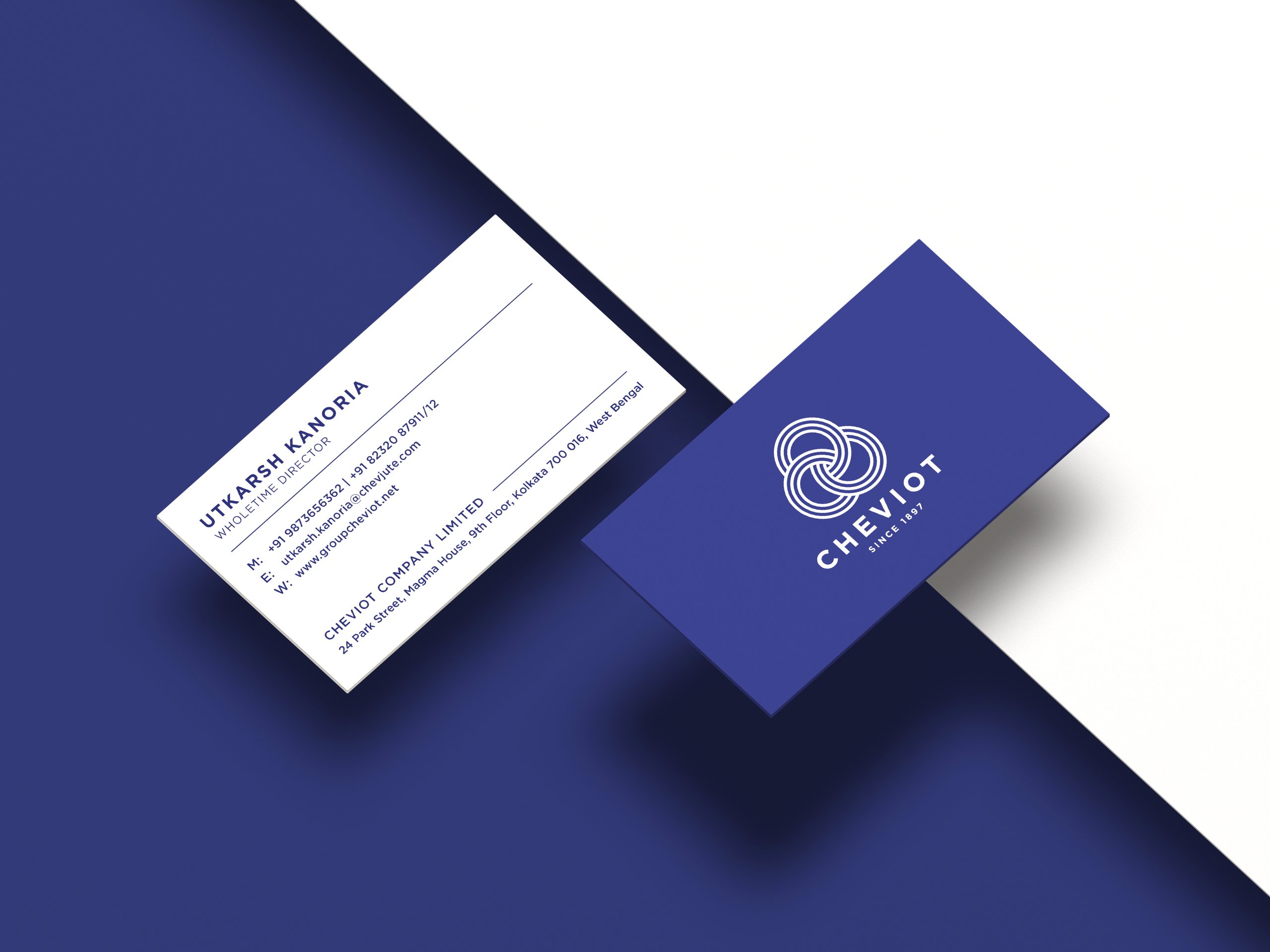
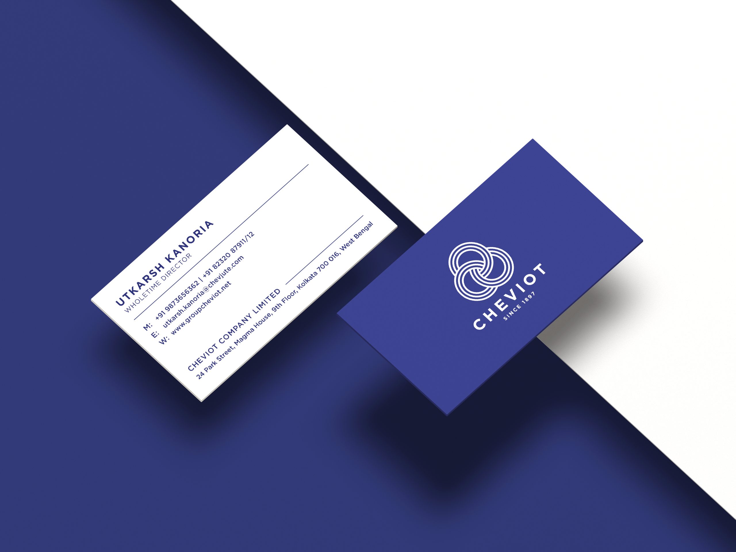
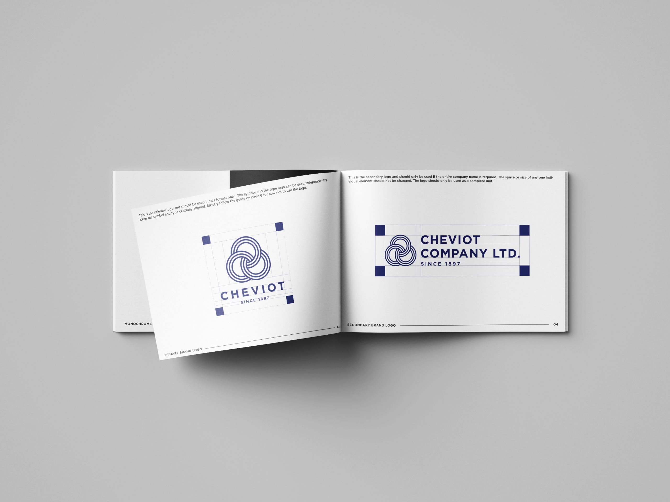
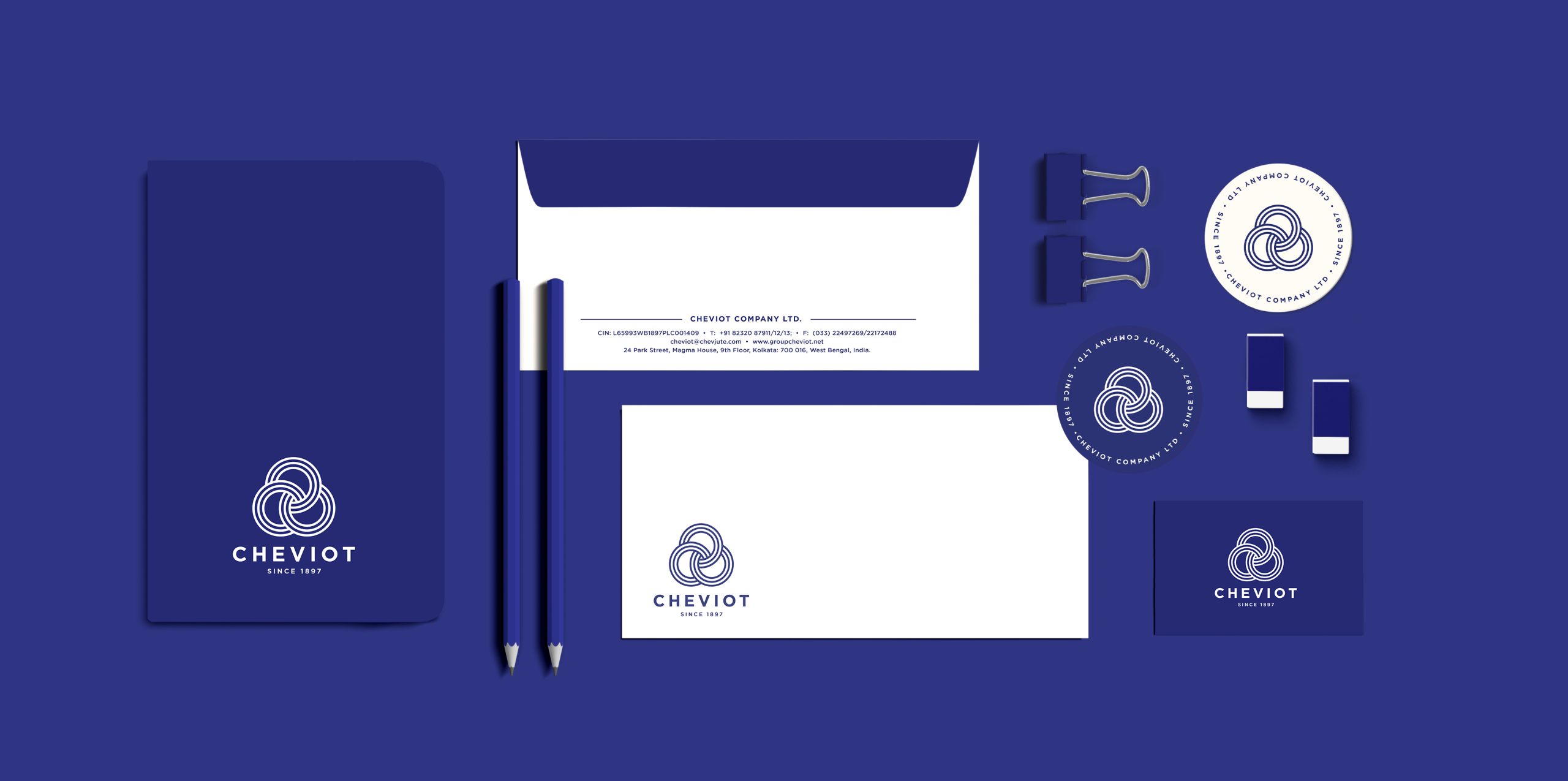
The structure of the symbol was derived from Cheviot’s old logo which was inspired by the three-leaf clover and the entwining of jute. The new logotype is a celebration of its strong heritage: where the three circles reinforce the company’s values of strength, boldness, and confidence.
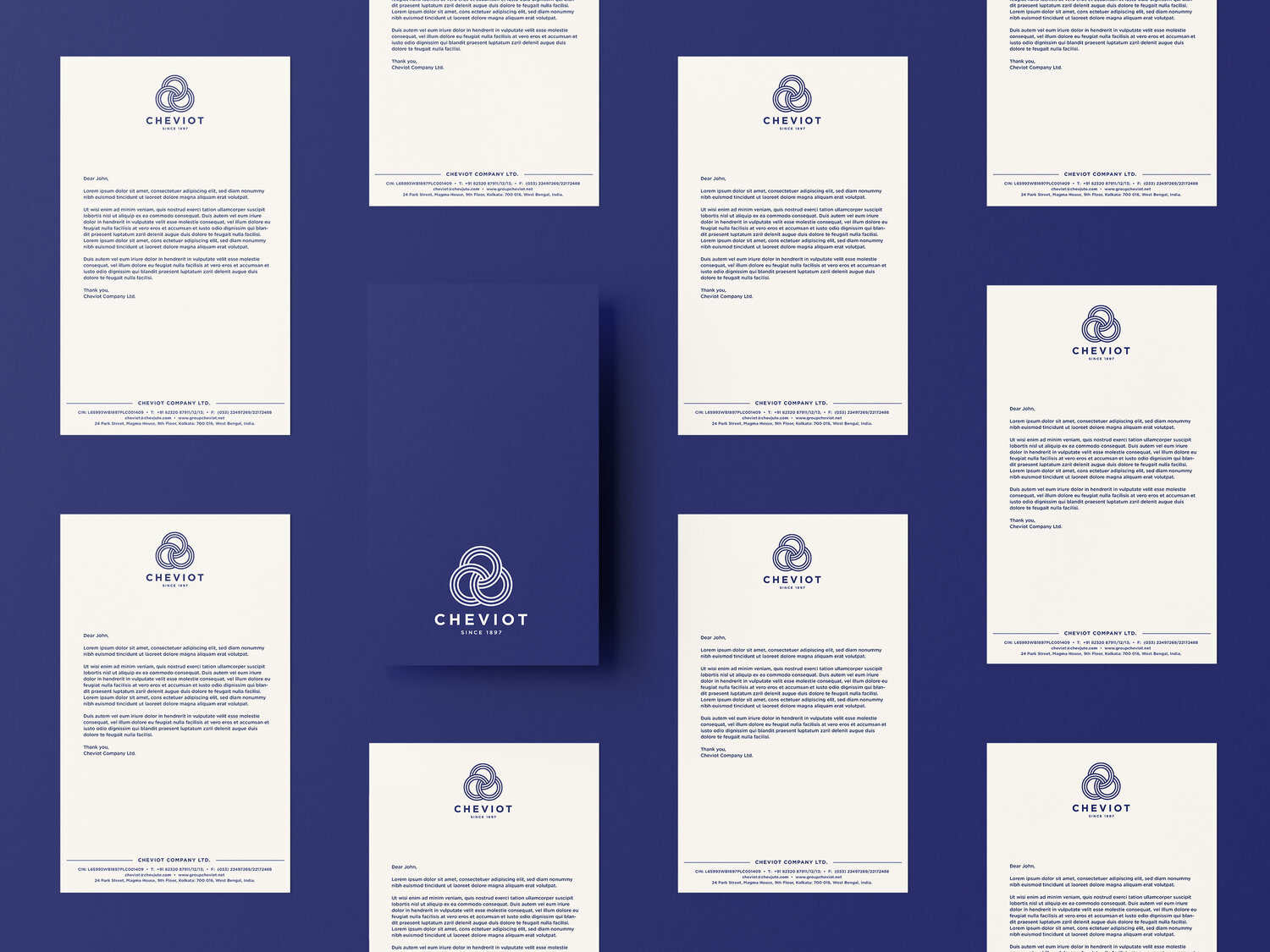
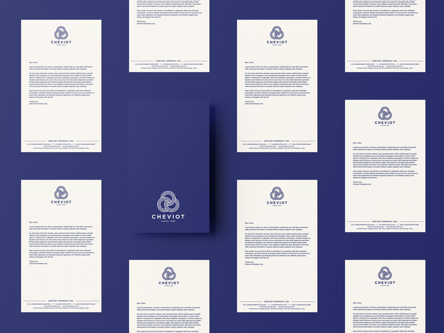
The primary colour is borrowed from the star in the Indian flag used during the British Raj. The colour palette includes a shade of navy with hints of ivory keeping it royal, clean and simple.
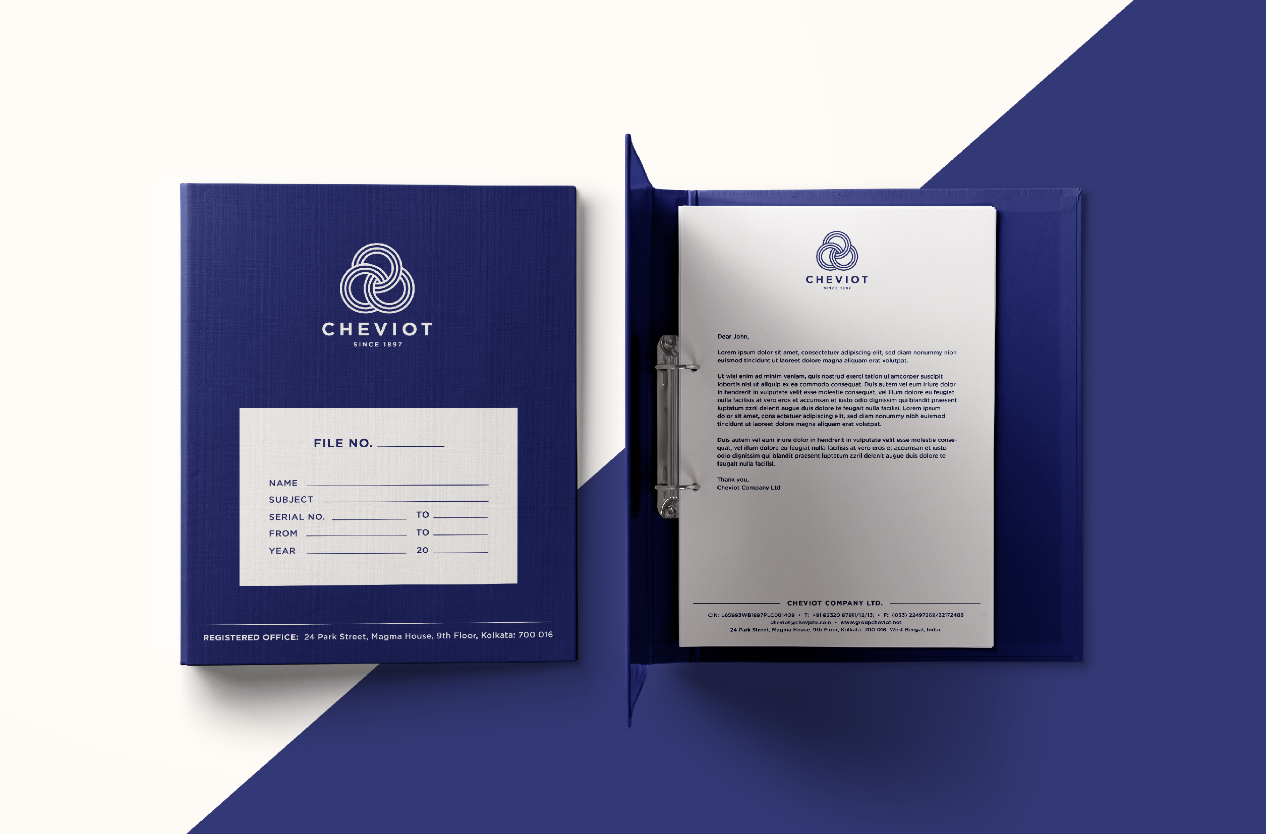
Their new wordmark was also designed to be flexible and adaptable for its many different applications. The renewed simple and minimal brand language was seamlessly carried throughout the initial print and digital brand activation elements.
Desserts are like an escape from the reality. It is suppose to be a unforgettable indulgence and so no one wants to compromise on either the taste, ingredients, look or anything else. They want the full package. Consumers feel consuming plant-based food is a compromise, they feel that the taste is not the same and only people who can’t consume regular desserts opt for vegan ones.
But with Ode To Gaia, it wasn’t true. Infact, if consumers didn’t know that the product was plant-based they would have never guessed it.
Client: Manufacturing and Industrials
Scope of work: Brand Strategy, Brand Identity and Communication Collaterals
Industry: Pharmaceutical & Health
Formed in 1879, Cheviot Company Ltd is an Indian manufacturer, supplier, and exporter of jute yarns and fabrics. They wanted to refresh their old brand identity and build a new, sophisticated, and relevant brand presence that resonated with their standing as one of the top five jute industries in India.
Keeping the company culture and beliefs in mind, we redesigned their brand language to make it align with their future vision.
Challenging as it initially seemed to renew the branding elements while restoring its integral components, it was an interesting process to study Cheviot’s core values and brainstorm on ways to depict them visually.
The structure of the symbol was derived from Cheviot’s old logo which was inspired by the three-leaf clover and the entwining of jute. The new logotype is a celebration of its strong heritage: where the three circles reinforce the company’s values of strength, boldness, and confidence.
The primary colour is borrowed from the star in the Indian flag used during the British Raj. The colour palette includes a shade of navy with hints of ivory keeping it royal, clean and simple.
Their new wordmark was also designed to be flexible and adaptable for its many different applications. The renewed simple and minimal brand language was seamlessly carried throughout the initial print and digital brand activation elements.
Desserts are like an escape from the reality. It is suppose to be a unforgettable indulgence and so no one wants to compromise on either the taste, ingredients, look or anything else. They want the full package. Consumers feel consuming plant-based food is a compromise, they feel that the taste is not the same and only people who can’t consume regular desserts opt for vegan ones.
But with Ode To Gaia, it wasn’t true. Infact, if consumers didn’t know that the product was plant-based they would have never guessed it.

Client: Aditi Kabra
Scope of work: Brand Strategy, Brand Identity, Product Packaging and Communication Collaterals
Industry: Home Decor & Furnishing
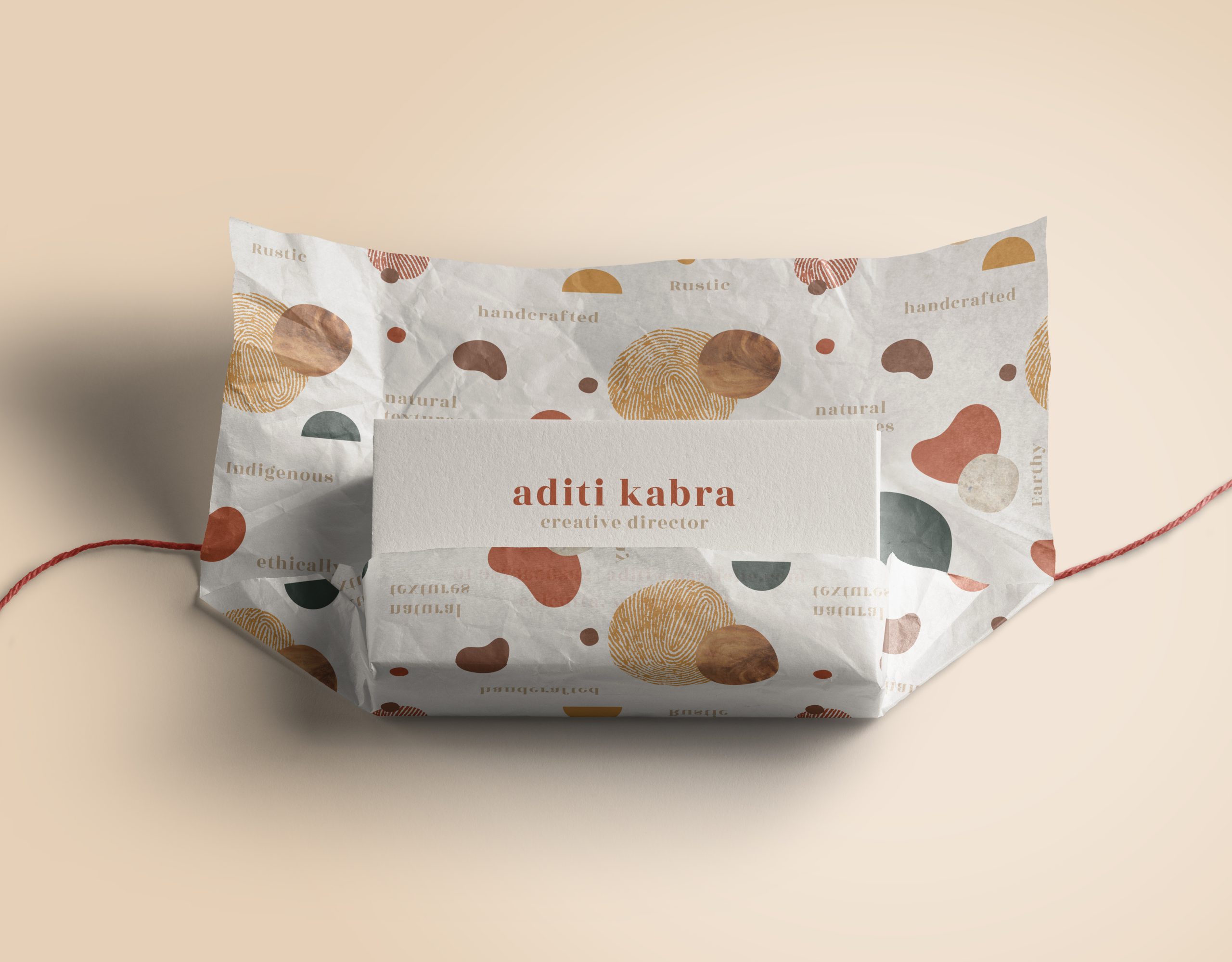
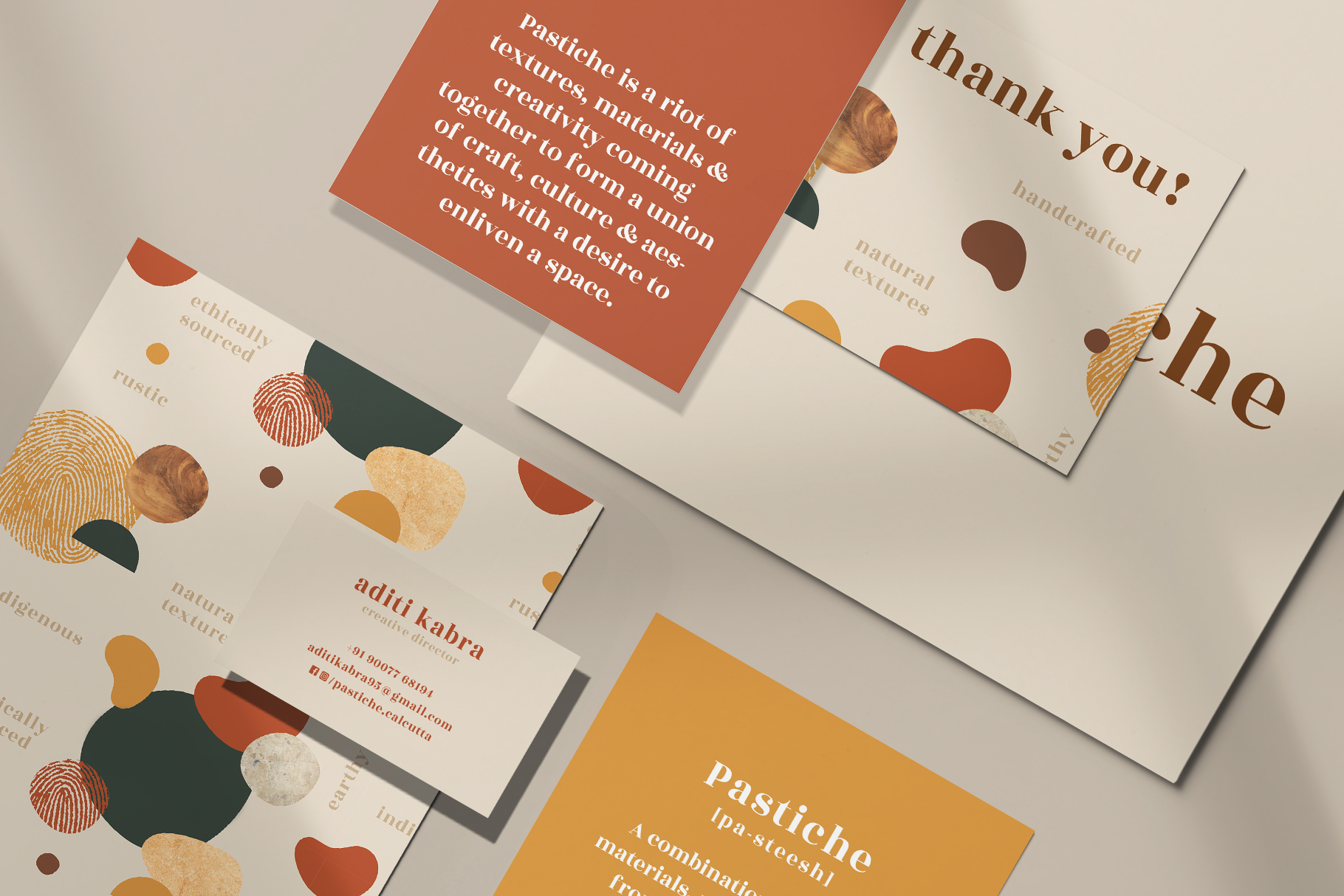
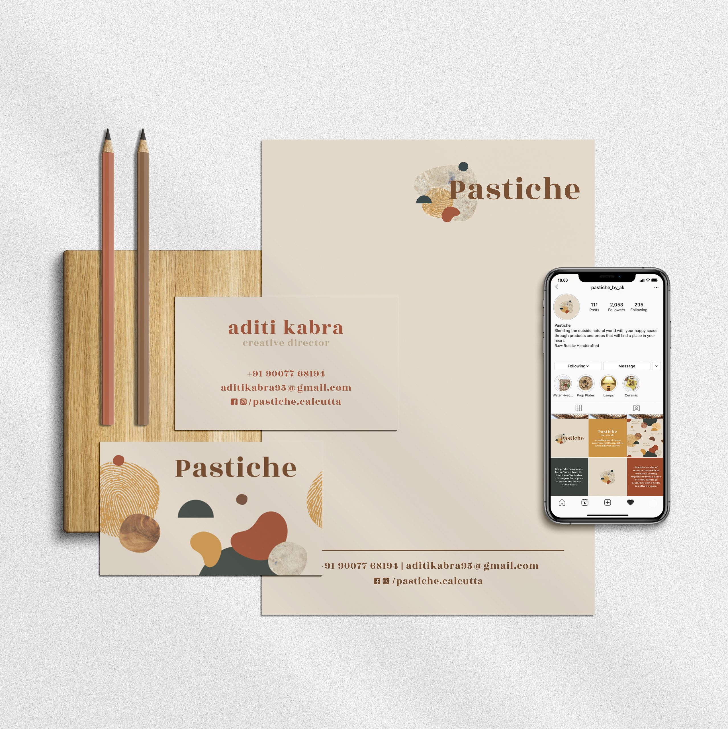
BRIEF: The world of Pastiche is a riot of textures, materials, and creativity oozing out to form a union of craft, culture, and aesthetics. Made by craftsmen from the interiors of India, their products are sure to find a place in your home and your heart.
APPROACH: As an extremely dynamic brand that offers a wide range of crafts, Pastiche called for an amalgamation of natural textures, colours, and contemporary settings. Every Pastiche product is carefully handmade by the local craftsmen, which had to be translated into their brand design.

How could we create a consistent language for a brand that uses traditional crafts from all around the world to make contemporary products?
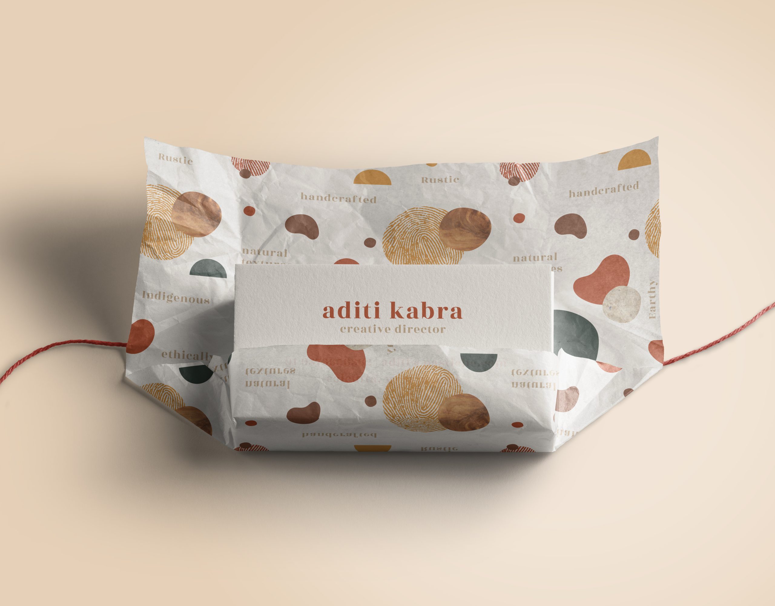
The first hurdle we encountered was to find a way of representing very different crafts through a unified visual entity and depicting Pastiche’s story of how artisans from across the country make contemporary products. Since each product had a different story to tell, we developed a brand pattern that showcased how different elements combine together to form something new.
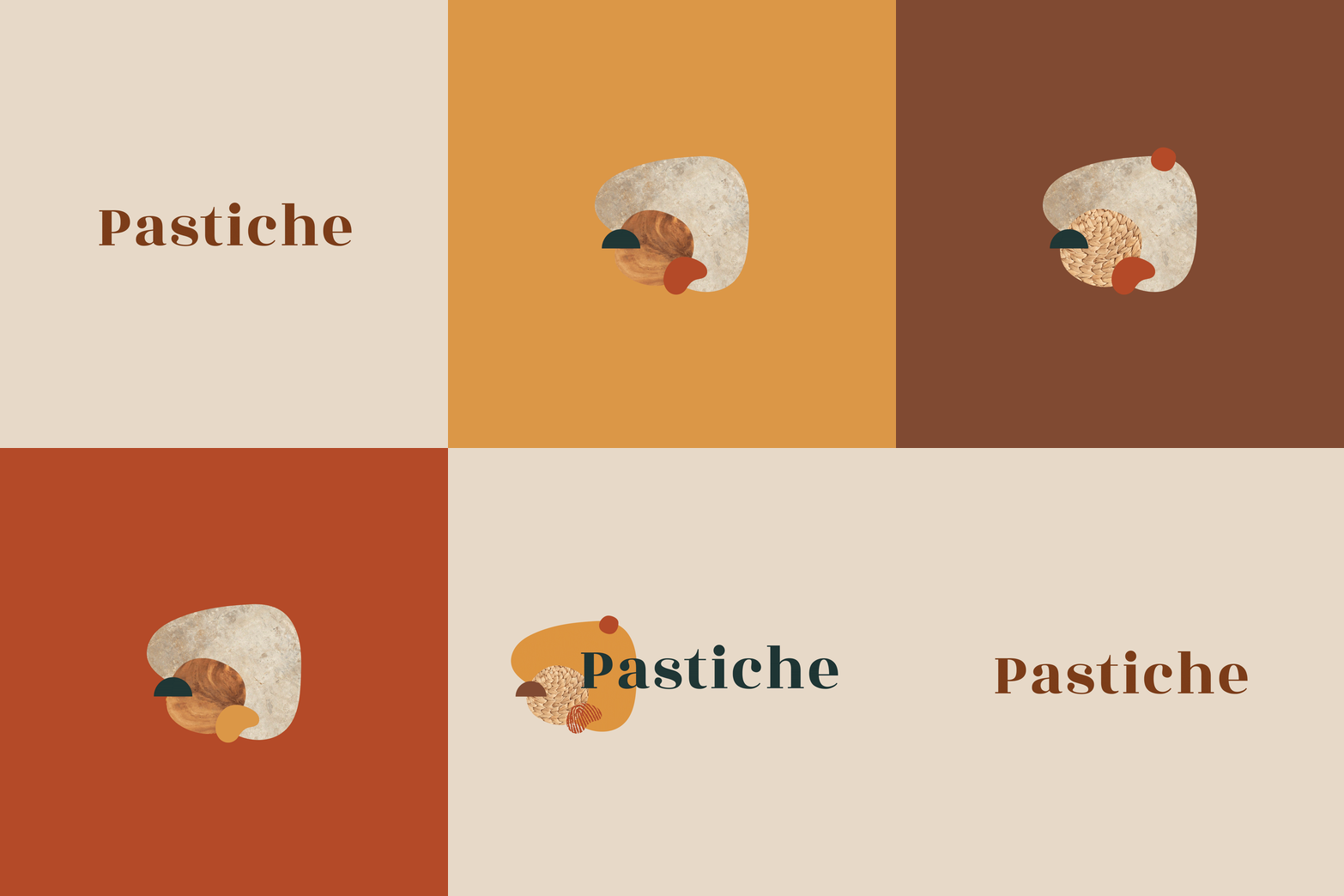
Each design element used was made of a different shape, size, and texture to mirror the diversity of their products. To signify how each product is handmade, we also integrated a fingerprint which became one of the most vital design elements.
All these elements combined together formed the logo for the brand Pastiche.

Client: Manufacturing and Industrials
Scope of work: Brand Strategy, Brand Identity and Communication Collaterals
Industry: Pharmaceutical & Health
Formed in 1879, Cheviot Company Ltd is an Indian manufacturer, supplier, and exporter of jute yarns and fabrics. They wanted to refresh their old brand identity and build a new, sophisticated, and relevant brand presence that resonated with their standing as one of the top five jute industries in India.
Keeping the company culture and beliefs in mind, we redesigned their brand language to make it align with their future vision.
Challenging as it initially seemed to renew the branding elements while restoring its integral components, it was an interesting process to study Cheviot’s core values and brainstorm on ways to depict them visually.
The structure of the symbol was derived from Cheviot’s old logo which was inspired by the three-leaf clover and the entwining of jute. The new logotype is a celebration of its strong heritage: where the three circles reinforce the company’s values of strength, boldness, and confidence.
The primary colour is borrowed from the star in the Indian flag used during the British Raj. The colour palette includes a shade of navy with hints of ivory keeping it royal, clean and simple.
Their new wordmark was also designed to be flexible and adaptable for its many different applications. The renewed simple and minimal brand language was seamlessly carried throughout the initial print and digital brand activation elements.
Desserts are like an escape from the reality. It is suppose to be a unforgettable indulgence and so no one wants to compromise on either the taste, ingredients, look or anything else. They want the full package. Consumers feel consuming plant-based food is a compromise, they feel that the taste is not the same and only people who can’t consume regular desserts opt for vegan ones.
But with Ode To Gaia, it wasn’t true. Infact, if consumers didn’t know that the product was plant-based they would have never guessed it.
Client: Manufacturing and Industrials
Scope of work: Brand Strategy, Brand Identity and Communication Collaterals
Industry: Pharmaceutical & Health
Formed in 1879, Cheviot Company Ltd is an Indian manufacturer, supplier, and exporter of jute yarns and fabrics. They wanted to refresh their old brand identity and build a new, sophisticated, and relevant brand presence that resonated with their standing as one of the top five jute industries in India.
Keeping the company culture and beliefs in mind, we redesigned their brand language to make it align with their future vision.
Challenging as it initially seemed to renew the branding elements while restoring its integral components, it was an interesting process to study Cheviot’s core values and brainstorm on ways to depict them visually.
The structure of the symbol was derived from Cheviot’s old logo which was inspired by the three-leaf clover and the entwining of jute. The new logotype is a celebration of its strong heritage: where the three circles reinforce the company’s values of strength, boldness, and confidence.
The primary colour is borrowed from the star in the Indian flag used during the British Raj. The colour palette includes a shade of navy with hints of ivory keeping it royal, clean and simple.
Their new wordmark was also designed to be flexible and adaptable for its many different applications. The renewed simple and minimal brand language was seamlessly carried throughout the initial print and digital brand activation elements.
Desserts are like an escape from the reality. It is suppose to be a unforgettable indulgence and so no one wants to compromise on either the taste, ingredients, look or anything else. They want the full package. Consumers feel consuming plant-based food is a compromise, they feel that the taste is not the same and only people who can’t consume regular desserts opt for vegan ones.
But with Ode To Gaia, it wasn’t true. Infact, if consumers didn’t know that the product was plant-based they would have never guessed it.
Client: Gauri Kohli
Scope of work: Brand Strategy, Brand Identity and Communication Collaterals
Industry: Education and Learning
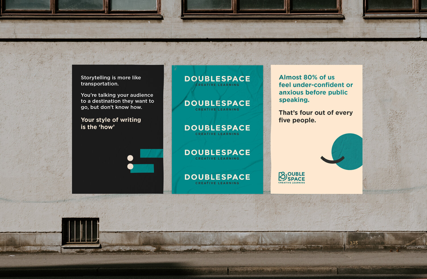
In today’s world of one too many modes of communication, DoubleSpace is a breath of fresh air. As a communication enhancer, they help you understand what to convey and when. Their mission is to combat the lack of communication in the Indian education landscape.
With the belief that all writing and speech can be made more effective when structured with the intention to spread a message, DoubleSpace required a branding language that communicated its own mission statement optimally. Our goal was to overcome the challenge of building a distinct visual identity for a company that centered around words and languages.
Through the brand language, we wanted to inspire the average Indian to be articulate communicators so that it would empower them to stand out from the crowd.
How do we create a strong visual identity for a brand that is all about words and language?
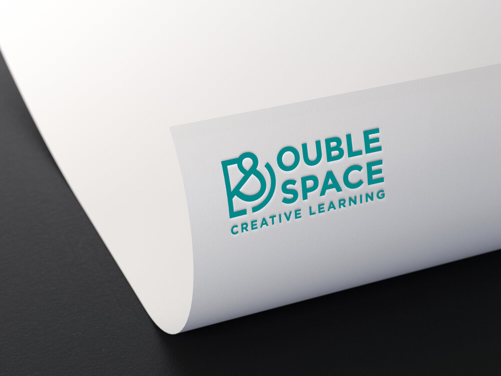
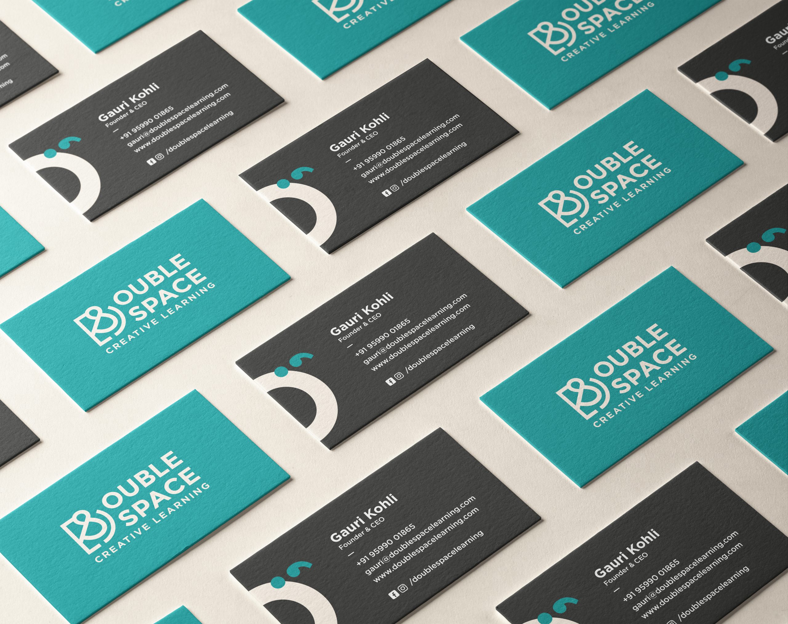
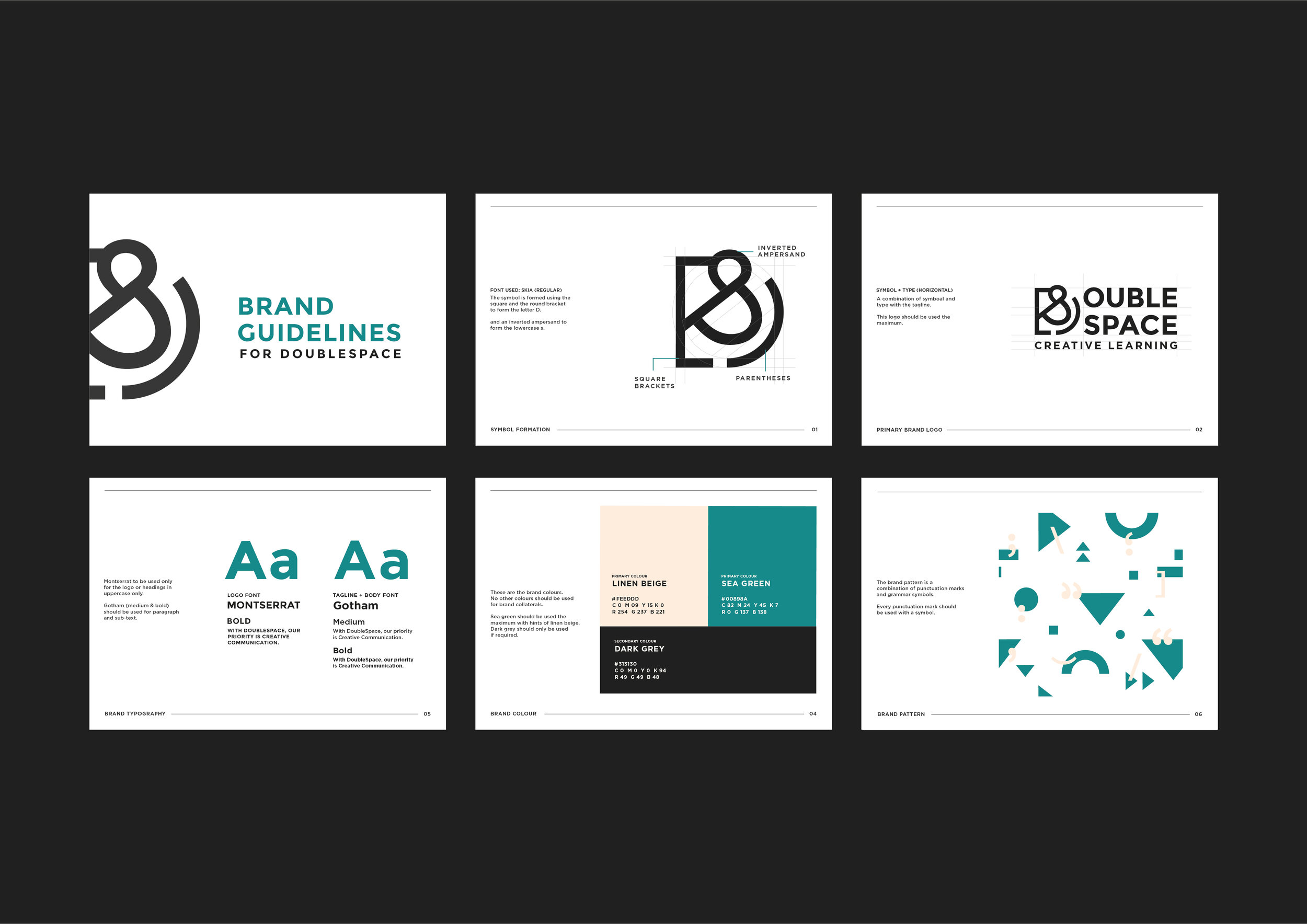
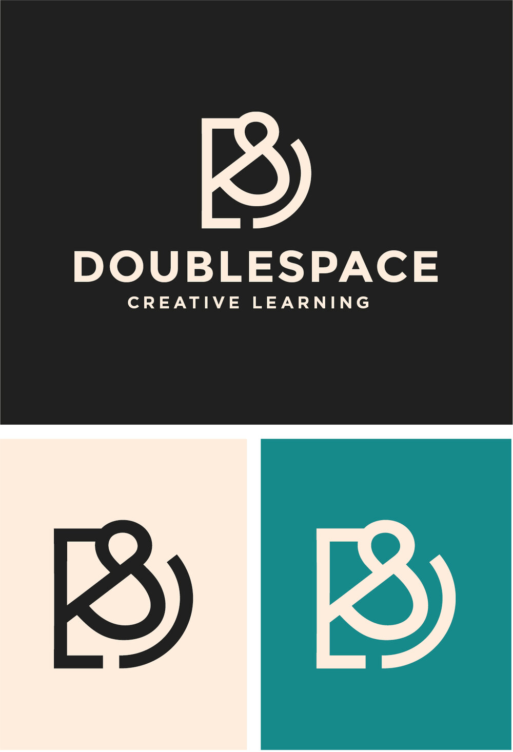
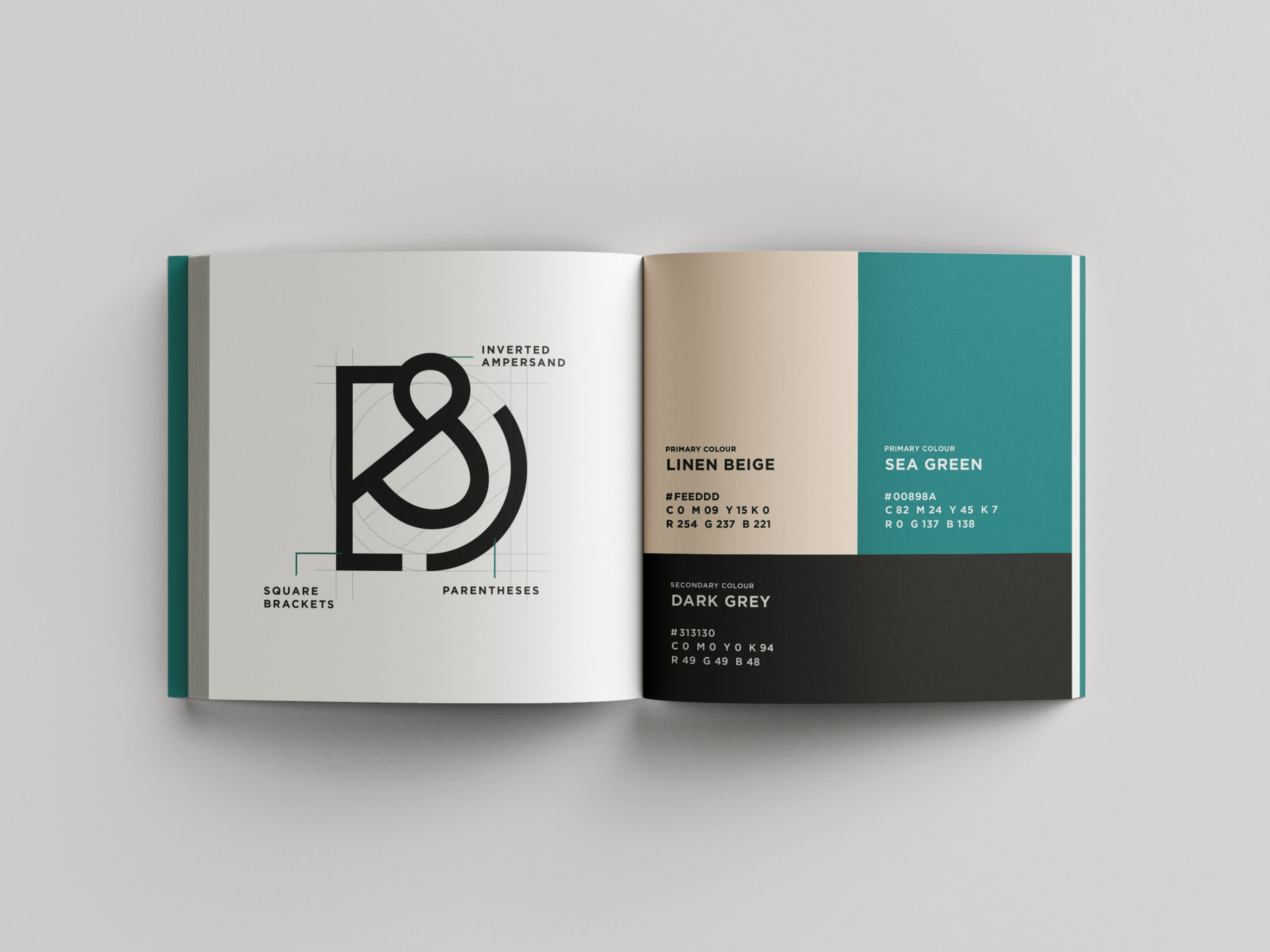
We began by focusing on how to integrate both words and imagery to build their brand language. After much brainstorming and drafting, we designed their symbol by combining two brackets and an inverted ampersand. Through this, we wanted to relay the importance of punctuation and grammar in writing and speech and highlight the fact that structure and placement are key ingredients for effective communication.
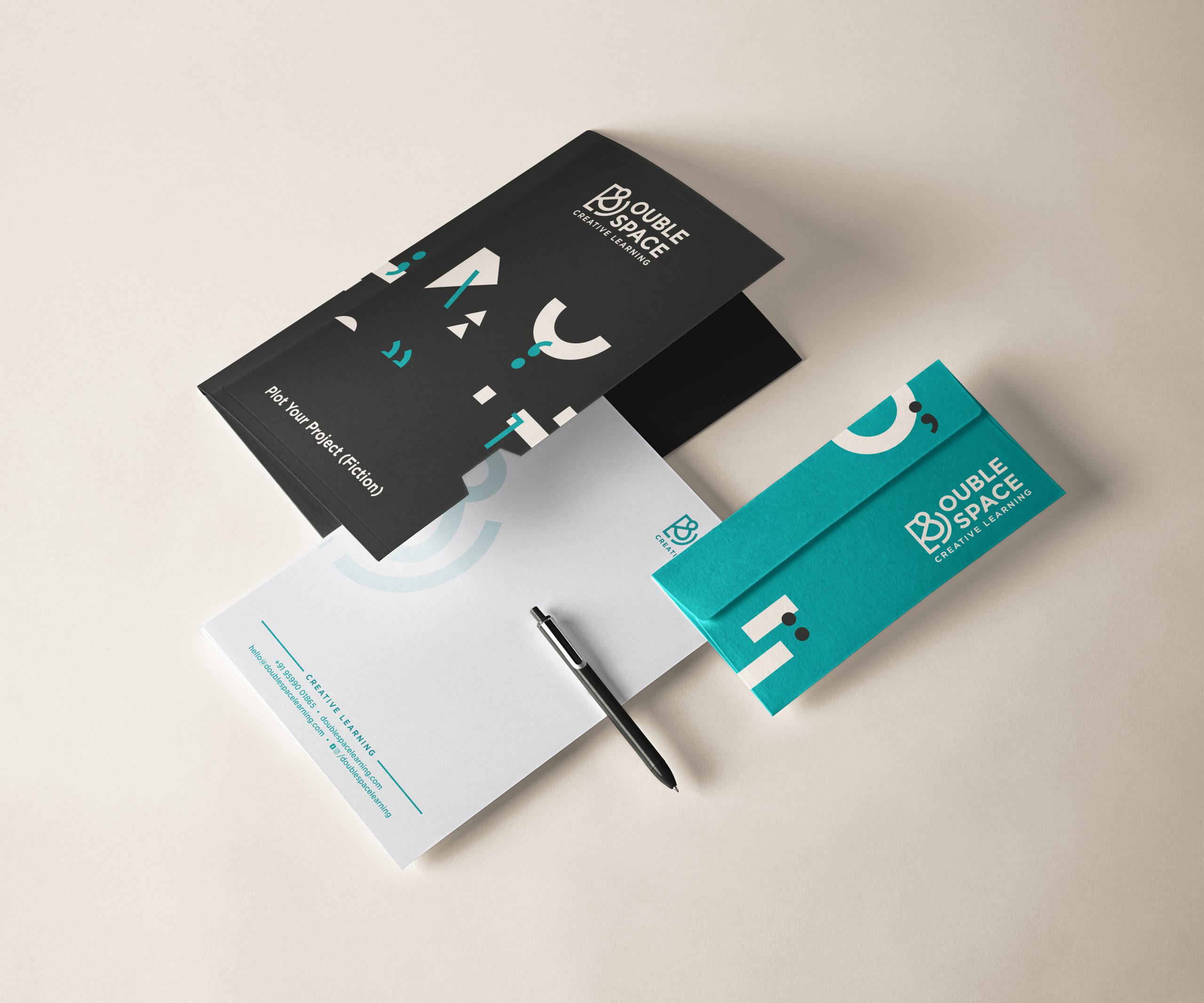
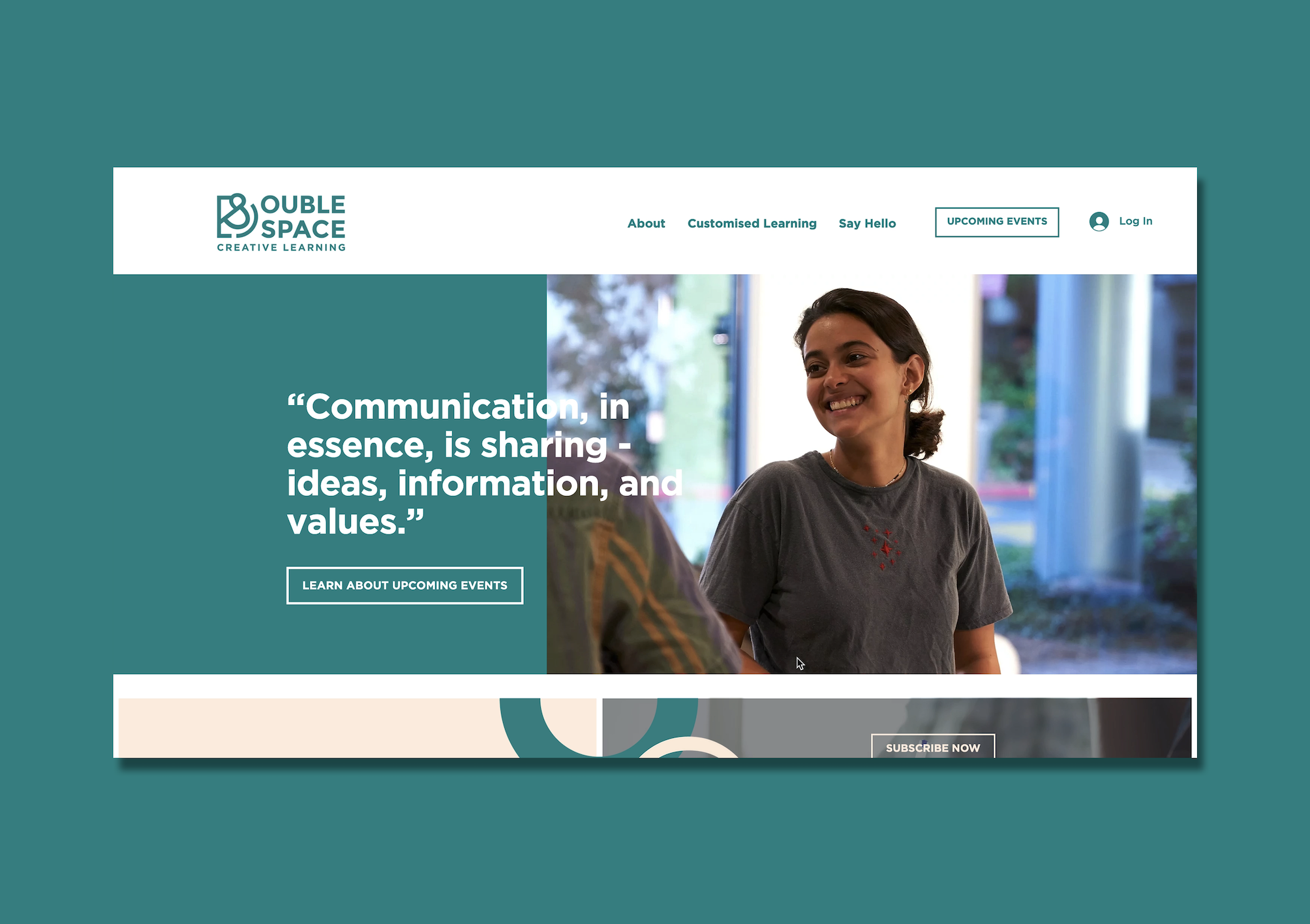
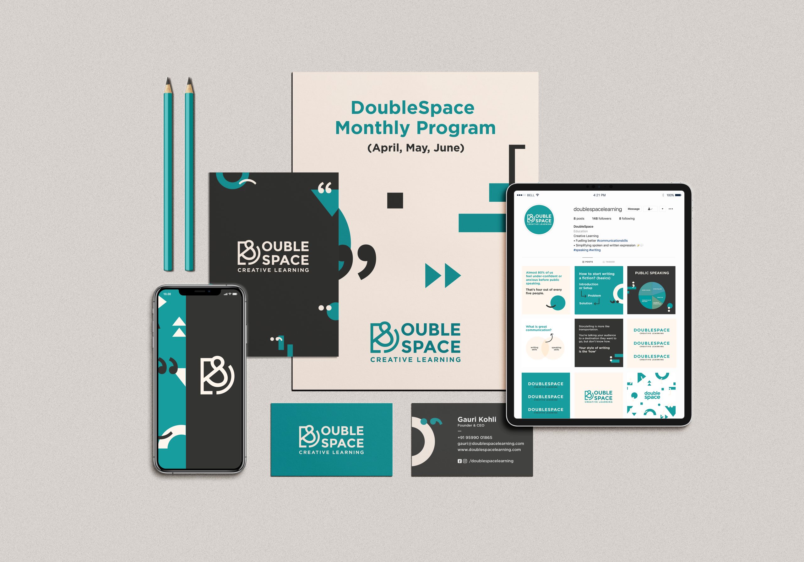
It was important that DoubleSpace had a wordmark and symbol with a very strong visual remembrance and the flexibility to be adaptable in different applications. We used a simple, bold sans serif typeface contrasting against a unique colour platter to incorporate the fun and vivacious energy that the brand offers.
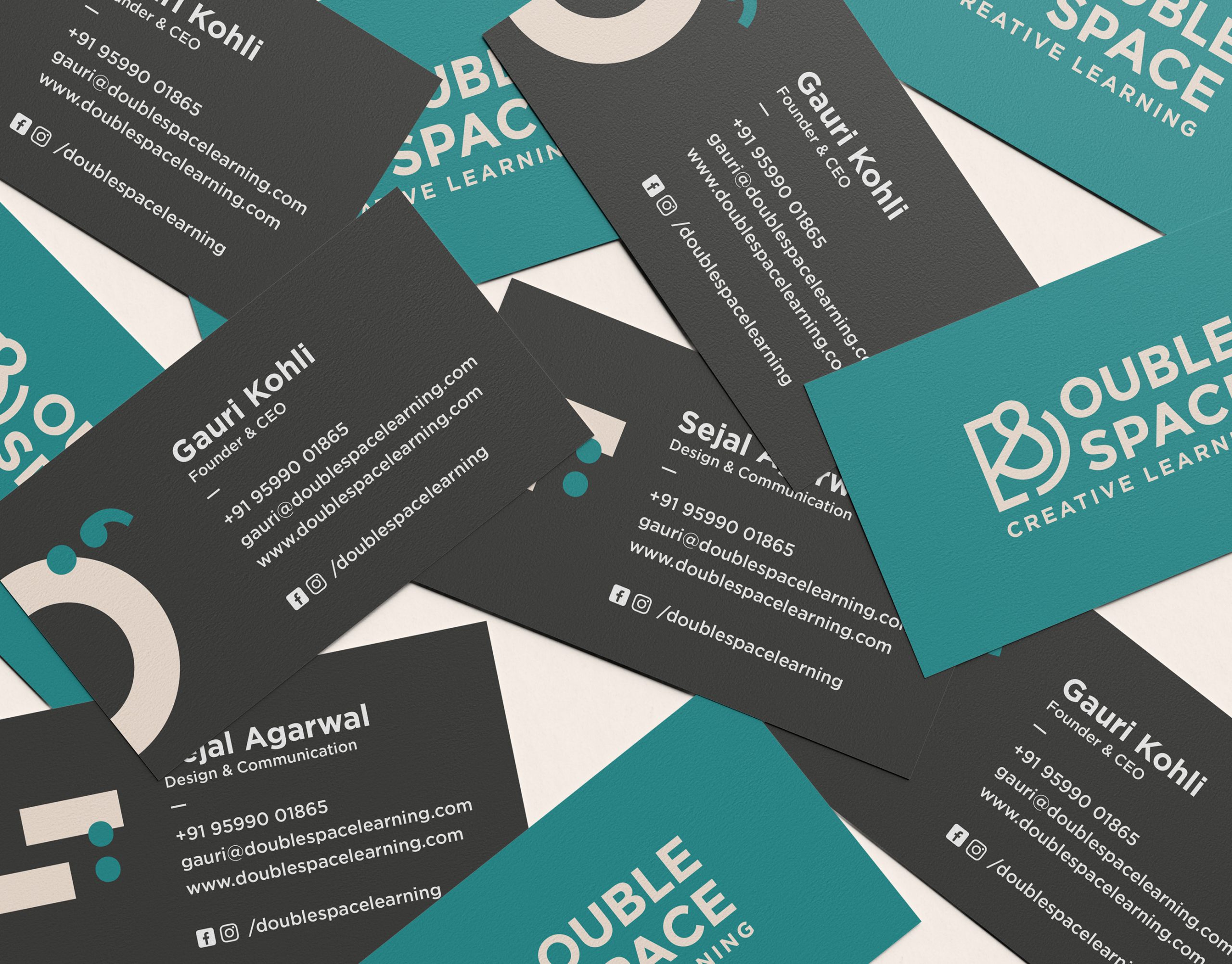
Using these elements, we created a strong visual guideline for the brand that was used across the brand collaterals and touch points.

Client: Gauri Kohli
Scope of work: Brand Strategy, Brand Identity and Communication Collaterals
Industry: Education and Learning
In today’s world of one too many modes of communication, DoubleSpace is a breath of fresh air. As a communication enhancer, they help you understand what to convey and when. Their mission is to combat the lack of communication in the Indian education landscape.
With the belief that all writing and speech can be made more effective when structured with the intention to spread a message, DoubleSpace required a branding language that communicated its own mission statement optimally. Our goal was to overcome the challenge of building a distinct visual identity for a company that centered around words and languages.
Through the brand language, we wanted to inspire the average Indian to be articulate communicators so that it would empower them to stand out from the crowd.
How do we create a strong visual identity for a brand that is all about words and language?
We began by focusing on how to integrate both words and imagery to build their brand language. After much brainstorming and drafting, we designed their symbol by combining two brackets and an inverted ampersand. Through this, we wanted to relay the importance of punctuation and grammar in writing and speech and highlight the fact that structure and placement are key ingredients for effective communication.
It was important that DoubleSpace had a wordmark and symbol with a very strong visual remembrance and the flexibility to be adaptable in different applications. We used a simple, bold sans serif typeface contrasting against a unique colour platter to incorporate the fun and vivacious energy that the brand offers.
Using these elements, we created a strong visual guideline for the brand that was used across the brand collaterals and touch points.
Client: Manufacturing and Industrials
Scope of work: Brand Strategy, Brand Identity and Communication Collaterals
Industry: Pharmaceutical & Health
Formed in 1879, Cheviot Company Ltd is an Indian manufacturer, supplier, and exporter of jute yarns and fabrics. They wanted to refresh their old brand identity and build a new, sophisticated, and relevant brand presence that resonated with their standing as one of the top five jute industries in India.
Keeping the company culture and beliefs in mind, we redesigned their brand language to make it align with their future vision.
Challenging as it initially seemed to renew the branding elements while restoring its integral components, it was an interesting process to study Cheviot’s core values and brainstorm on ways to depict them visually.
The structure of the symbol was derived from Cheviot’s old logo which was inspired by the three-leaf clover and the entwining of jute. The new logotype is a celebration of its strong heritage: where the three circles reinforce the company’s values of strength, boldness, and confidence.
The primary colour is borrowed from the star in the Indian flag used during the British Raj. The colour palette includes a shade of navy with hints of ivory keeping it royal, clean and simple.
Their new wordmark was also designed to be flexible and adaptable for its many different applications. The renewed simple and minimal brand language was seamlessly carried throughout the initial print and digital brand activation elements.
Desserts are like an escape from the reality. It is suppose to be a unforgettable indulgence and so no one wants to compromise on either the taste, ingredients, look or anything else. They want the full package. Consumers feel consuming plant-based food is a compromise, they feel that the taste is not the same and only people who can’t consume regular desserts opt for vegan ones.
But with Ode To Gaia, it wasn’t true. Infact, if consumers didn’t know that the product was plant-based they would have never guessed it.